

Button styling
This guide will help you customize the Express checkout button—covering themes and shapes to ensure a seamless and trustworthy checkout experience, while leveraging Klarna’s strong brand to boost your conversions.
5 min read
Where to find the button
Klarna Express Checkout button can be displayed on your product, cart or checkout page offering returning Klarna users a one-click experience that reduces friction and captures impulse purchases by streamlining the route to purchase and boosting conversion. Express Checkout can make checkout 5x faster than normal.
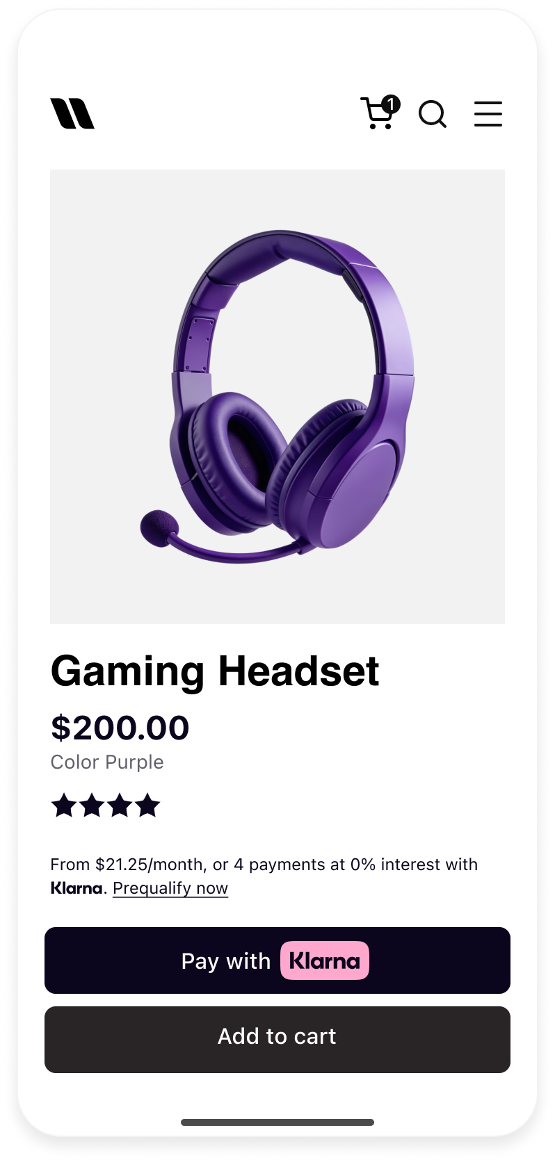 | 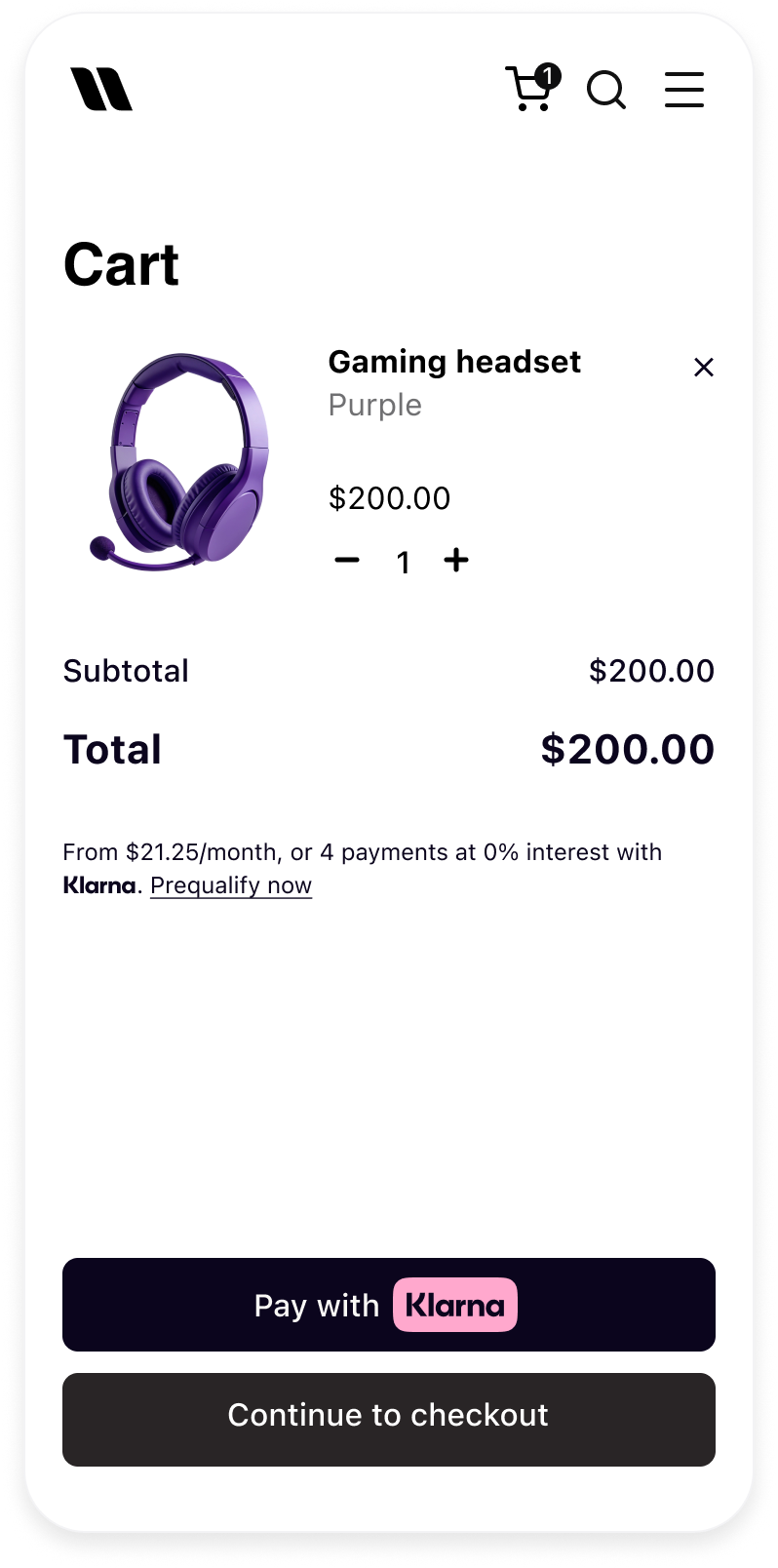 | 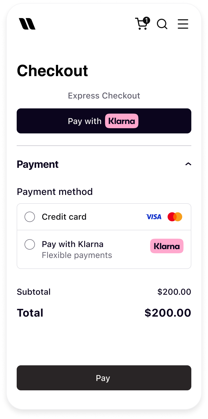 |
| Klarna button in product detail page | Klarna button in cart | Klarna button in checkout |
Theme
The theme defines the button’s color. You can change the theme by setting the value of the
theme attribute.Apart from the default dark theme, you can apply the light theme to have the button displayed in white, or the outlined theme to render the white button with an outline.
Default theme (dark)
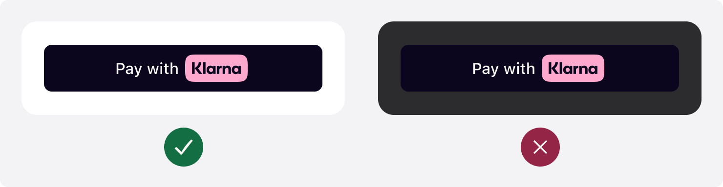
The button’s default theme color is dark. As the
theme attribute is optional, the default theme is applied both when you set the attribute to default or if you omit it from the source code altogether. Don’t use default theme on black or dark backgrounds. The button must be used on backgrounds that provide sufficient contrast.We recommend using the default theme as it’s widely recognized by Klarna customers and looks good on light backgrounds.
JAVASCRIPT
1
2
3
4
5
6
7
8
9
window.klarnaAsyncCallback = () => {
window.Klarna.Payments.Buttons.init(...).load(
{
container: "#container",
theme: "default", // Used to set the theme of the button
...
):
};
Sample code to render the default Express checkout button.
Light theme
Use the light theme to make the button visible on dark backgrounds. To apply the light theme, set the
theme attribute to light. Don’t use light theme on white or light backgrounds. The button must be used on backgrounds that provide sufficient contrast.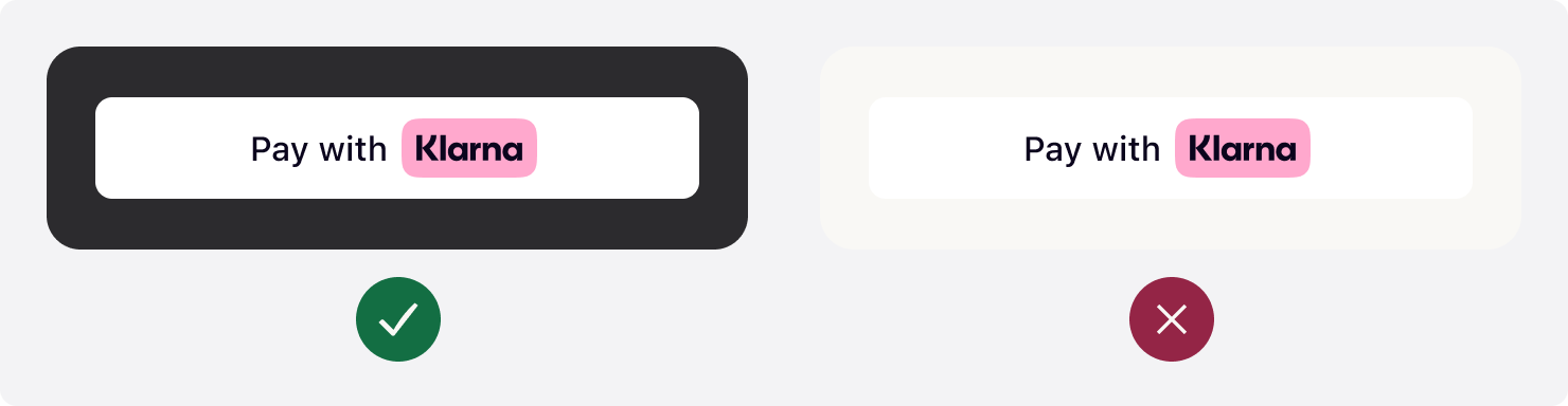
JAVASCRIPT
1
2
3
4
5
6
7
8
9
window.klarnaAsyncCallback =  () => {
  window.Klarna.Payments.Buttons.init(...).load(
    {
      container: "#container",
      theme: "light", // Used to set the theme of the button to light
      ...
  ):
};
Sample code to render a white Express Checkout button.
Outlined theme
Use the outlined theme to make the button visible on all backgrounds. To apply the this theme, set the
theme attribute to outlined. Don’t place on dark or saturated backgrounds. The button must be used on backgrounds that provide sufficient contrast.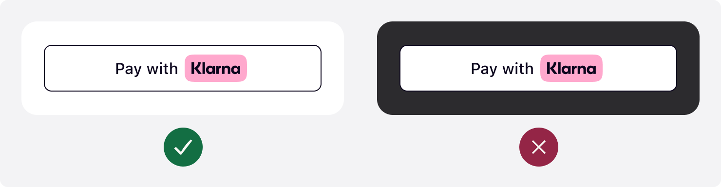
JAVASCRIPT
1
2
3
4
5
6
7
8
9
window.klarnaAsyncCallback =  () => {
  window.Klarna.Payments.Buttons.init(...).load(
    {
      container: "#container",
      theme: "outlined", // Used to set the theme of the button
      ...
  ):
};
Sample code to render a white, outlined Express checkout button.
Button shape
Customizing the shape of the button to match your site's look and feel is a key step in creating a visually cohesive and engaging user experience. To control the button's shape, change the value of the
shape attribute.There are three shapes available with the Express checkout button: default, rectangular, and pill.
Rounded corners (default)
The default button shape is a rectangle with rounded corners. To apply the default shape, set the
shape attribute of the element to default.
JAVASCRIPT
1
2
3
4
5
6
7
8
9
window.klarnaAsyncCallback =  () => {
  window.Klarna.Payments.Buttons.init(...).load(
    {
      container: "#container",
      shape: "default", // Used to define the shape of the button
      ...
  ):
};
Sample code to render the Express checkout button in the default shape.
Minimum corner radius
To apply the rectangular shape with square corners, set the
shape attribute of the element to rect.
JAVASCRIPT
1
2
3
4
5
6
7
8
9
window.klarnaAsyncCallback =  () => {
  window.Klarna.Payments.Buttons.init(...).load(
    {
      container: "#container",
      shape: "rect", // Used to style the button with a rectangular shape with square corners
      ...
  ):
};
Sample code to render the Express checkout button in the rectangle shape with square corners.
Maximum corner radius
To apply the pill shape, set the
shape attribute of the element to pill.
JAVASCRIPT
1
2
3
4
5
6
7
8
9
window.klarnaAsyncCallback =  () => {
  window.Klarna.Payments.Buttons.init(...).load(
    {
      container: "#container",
      shape: "pill", // Used to style the button in a pill shape
      ...
  ):
};
Sample code to render the Express checkout button in the pill shape.
Button size
Width
Prominently display the Klarna button. Make the button the same width as other payment buttons in stacked button layouts.
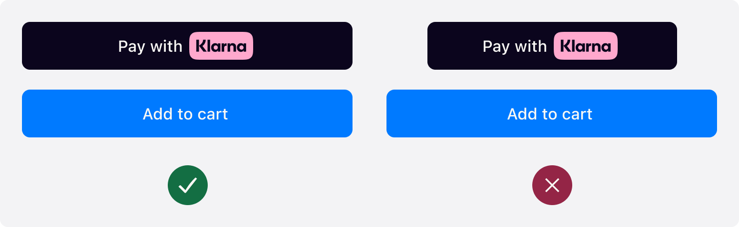
When the width of button is below 160px or the copy does not fit in the button, the text is removed and only the Klarna wordmark is shown.

Height
The default recommended height of the Klarna button is 48px and the min height allowed is 40px. Make sure the button is the same height of other payment buttons
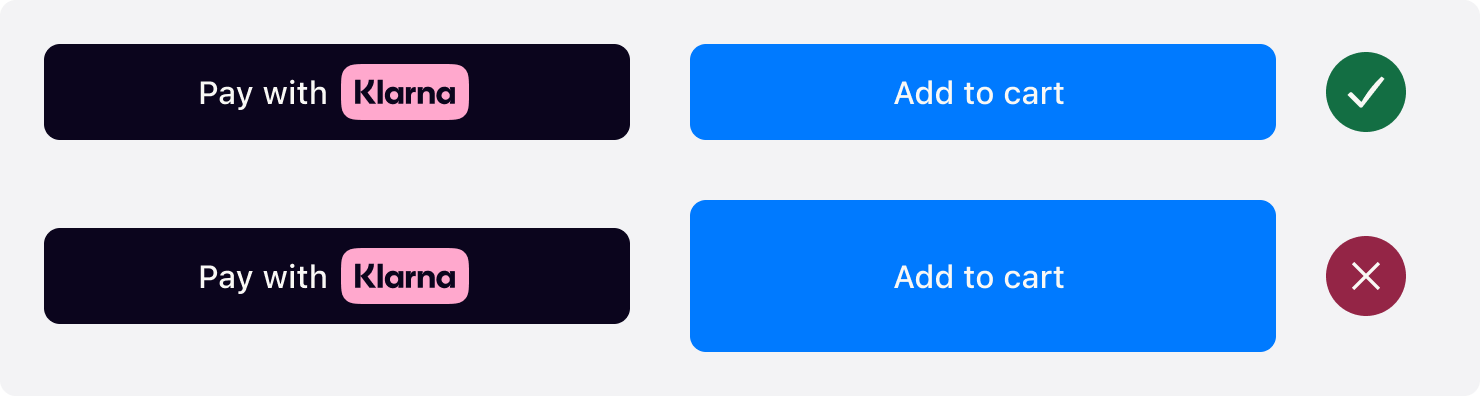
Jump to section...