

Klarna Buttons Styling
Customize the Sign in with Klarna buttons for the integration with flexible themes and shapes. Use the provided code snippets to implement styles quickly and easily.
5 min read
Where to find the button
The Sign in with Klarna button allows customers to authenticate using Klarna credentials, reducing friction and pre-filling personal details at checkout. It also gives Partners access to user data for personalization. It is found on Homepage, Login, and Register pages.
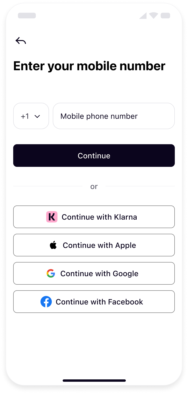 | 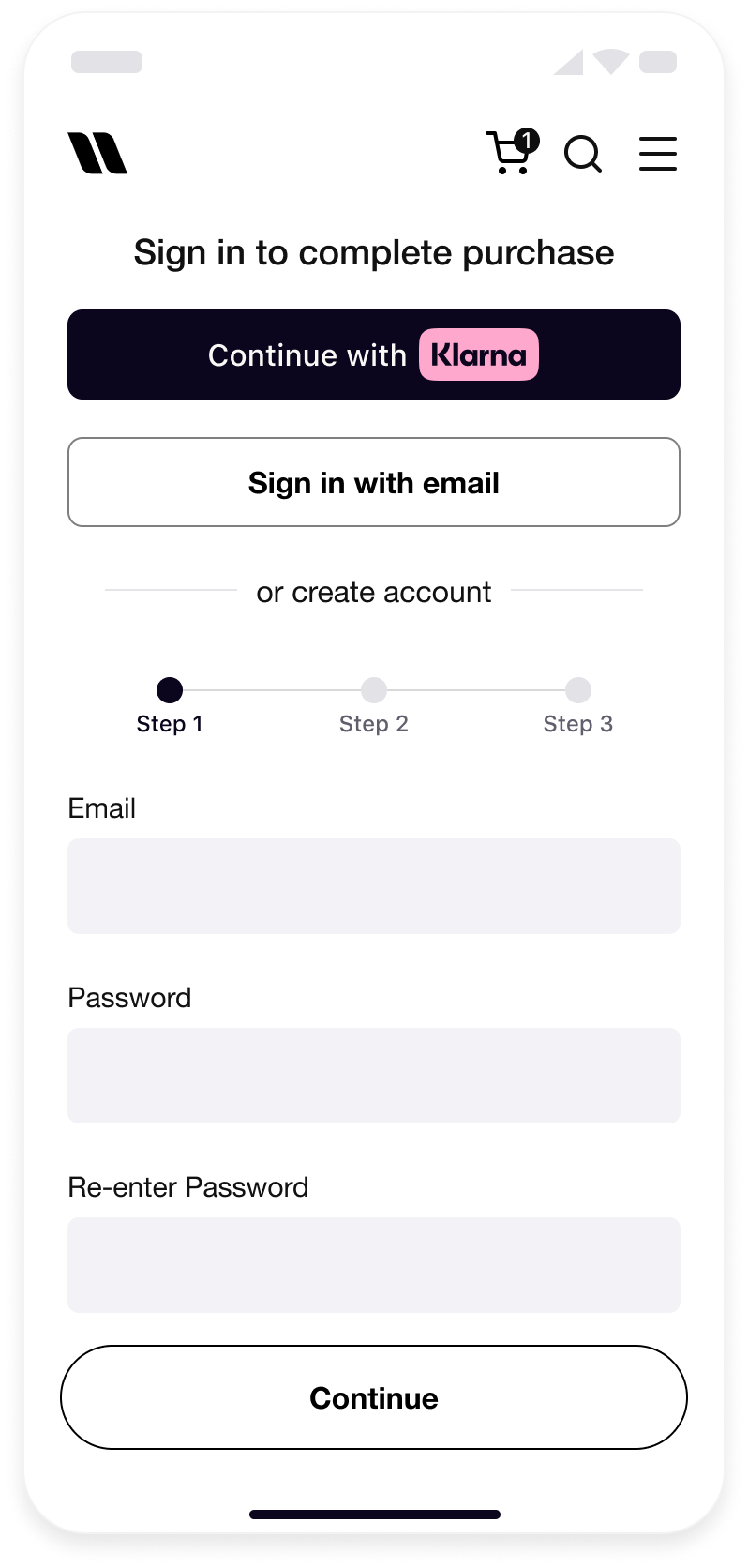 |
| Account login | Account creation |
Theme
The theme defines the button's color. The theme can be changed by setting the value of the
theme attribute.Apart from the default dark theme, the light theme can be applied to display the button in white, or the outlined theme to render the white button with an outline.
Default theme (dark)
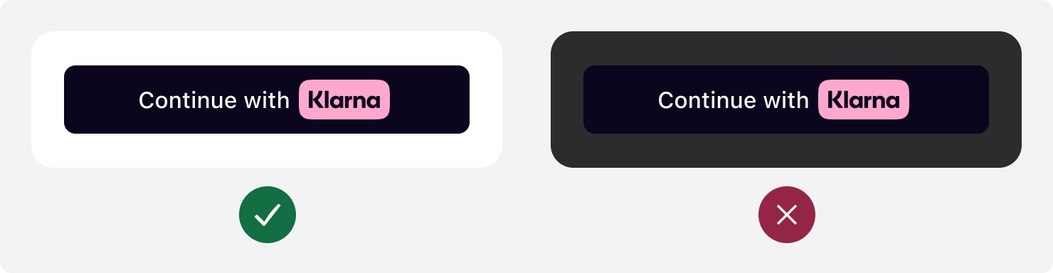
The button's default theme color is dark. As the
theme attribute is optional, the default theme is applied both when the attribute is set to default and when it is omitted from the source code altogether. Avoid using the default theme on black or dark backgrounds. The button must be used on backgrounds that provide sufficient contrast.The default theme is recommended because it is widely recognized by Klarna customers and looks good on light backgrounds.
JAVASCRIPT
1
2
3
4
5
6
const siwkButton = klarna.Identity.button({
scope: "openid offline_access payment:request:create profile:name",
redirectUri: "http://localhost:3000/callback.html",
theme: "default",
})
Light theme
Use the light theme to make the button visible on dark backgrounds. To apply the light theme, set the
theme attribute to light. Avoid using the light theme on white or light backgrounds. The button must be used on backgrounds that provide sufficient contrast.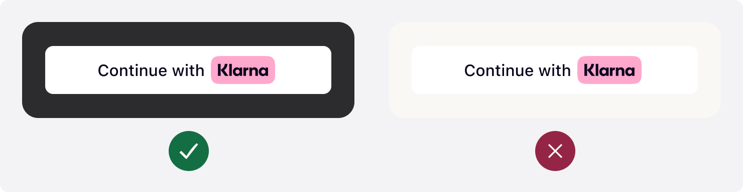
JAVASCRIPT
1
2
3
4
5
6
const siwkButton = klarna.Identity.button({
  scope: "openid offline_access payment:request:create profile:name",
  redirectUri: "http://localhost:3000/callback.html",
  theme: "light",
})
Outlined theme
Use the outlined theme to make the button visible on all backgrounds. To apply this theme, set the
theme attribute to outlined. Avoid placing the button on dark or saturated backgrounds. The button must be used on backgrounds that provide sufficient contrast.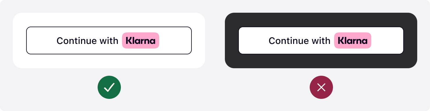
JAVASCRIPT
1
2
3
4
5
6
const siwkButton = klarna.Identity.button({
  scope: "openid offline_access payment:request:create profile:name",
  redirectUri: "http://localhost:3000/callback.html",
  theme: "outlined",
})
Button shape
Customizing the shape of the button to match the site's look and feel is a key step in creating a visually cohesive and engaging user experience. To control the button's shape, change the value of the
shape attribute.There are three shapes available with the Sign in with Klarna button: default, rectangular, and pill.
Rounded corners (default)
The default button shape is a rectangle with rounded corners. To apply the default shape, set the
shape attribute of the element to default.
JAVASCRIPT
1
2
3
4
5
6
const siwkButton = klarna.Identity.button({
  scope: "openid offline_access payment:request:create profile:name",
  redirectUri: "http://localhost:3000/callback.html",
  shape: "default",
})
Minimum corner radius
To apply the rectangular shape with square corners, set the
shape attribute of the element to rect.
JAVASCRIPT
1
2
3
4
5
6
const siwkButton = klarna.Identity.button({
  scope: "openid offline_access payment:request:create profile:name",
  redirectUri: "http://localhost:3000/callback.html",
  shape: "rect",
})
Maximum corner radius
To apply the pill shape, set the
shape attribute of the element to pill.
JAVASCRIPT
1
2
3
4
5
6
const siwkButton = klarna.Identity.button({
  scope: "openid offline_access payment:request:create profile:name",
  redirectUri: "http://localhost:3000/callback.html",
  shape: "pill",
})
Button size
Width
Display the Klarna button prominently. Make the button the same width as other payment buttons in stacked button layouts.
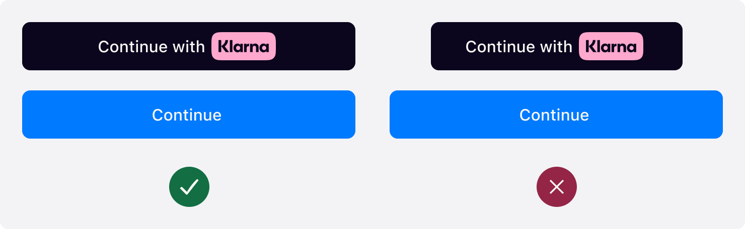
When the width of the button is below 160px or the copy does not fit in the button, the text is removed and only the Klarna wordmark is shown.

Height
The default recommended height of the Klarna button is 48px and the minimum height allowed is 40px. Ensure the button has the same height as other payment buttons.
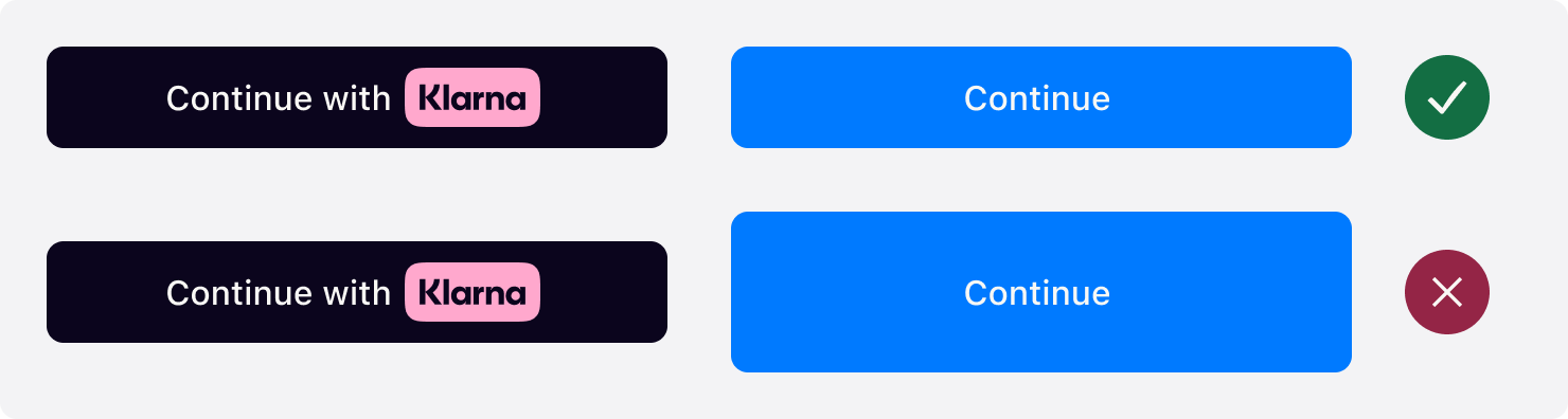
Button Klarna branding
There are three ways to display the Klarna trademark on the button: badge, left icon, or centered icon. These variants are available to ensure there is a button variant aligned with the Partner's UI patterns. To control the button's alignment, change the value of the
logoAlignment attribute.Default
The default alignment is the Klarna badge centered with text before. To apply the default shape, set the
logAlignment attribute of the Identity. function to default.
JAVASCRIPT
1
2
3
4
5
6
const siwkButton = klarna.Identity.button({
  scope: "openid offline_access payment:request:create profile:name",
  redirectUri: "http://localhost:3000/callback.html",
  logoAlignment: "default",
})
Left icon alignment
To use the Klarna icon aligned to the left of the button, set the
logoAlignment attribute of the Identity. function to left.
JAVASCRIPT
1
2
3
4
5
6
const siwkButton = klarna.Identity.button({
  scope: "openid offline_access payment:request:create profile:name",
  redirectUri: "http://localhost:3000/callback.html",
  logoAlignment: "left",
})
Centered icon alignment
To position the Klarna icon at the center with the text trailing, set the
logoAlignment attribute of the Identity. function to center.
JAVASCRIPT
1
2
3
4
5
6
const siwkButton = klarna.Identity.button({
  scope: "openid offline_access payment:request:create profile:name",
  redirectUri: "http://localhost:3000/callback.html",
  logoAlignment: "center",
})
Jump to section...