

OSM Placements
On-site messaging placements showcase Klarna payment options and promotions at key moments in the customer journey to boost awareness and conversion.
10 min read
On-site messaging placements overview
On-site messaging placements are containers that hold Klarna messaging assets and are placed on recommended pages of the store based on type. There are two types: (1) site-wide placements, that are shown across multiple pages to ensure consistent visibility, and (2) product and cart placements, shown in context-specific areas like product or cart pages to reinforce messaging at key decision points.
Site-wide placements
- Top Strip: A persistent banner that reminds customers Klarna is available, with a brief message explaining flexible payment options. This builds early awareness from the first touchpoint.
- Footer: Klarna's logo is shown alongside other accepted payment methods, reinforcing trust and availability without disrupting the user experience.
- FAQ Page: A dedicated, localized landing page that explains how Klarna works, answers common questions, and supports decision-making with transparent information.
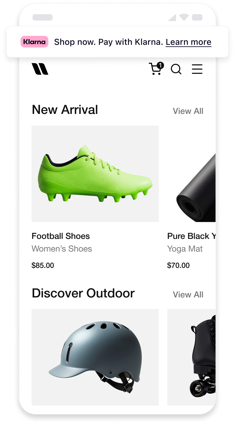 | 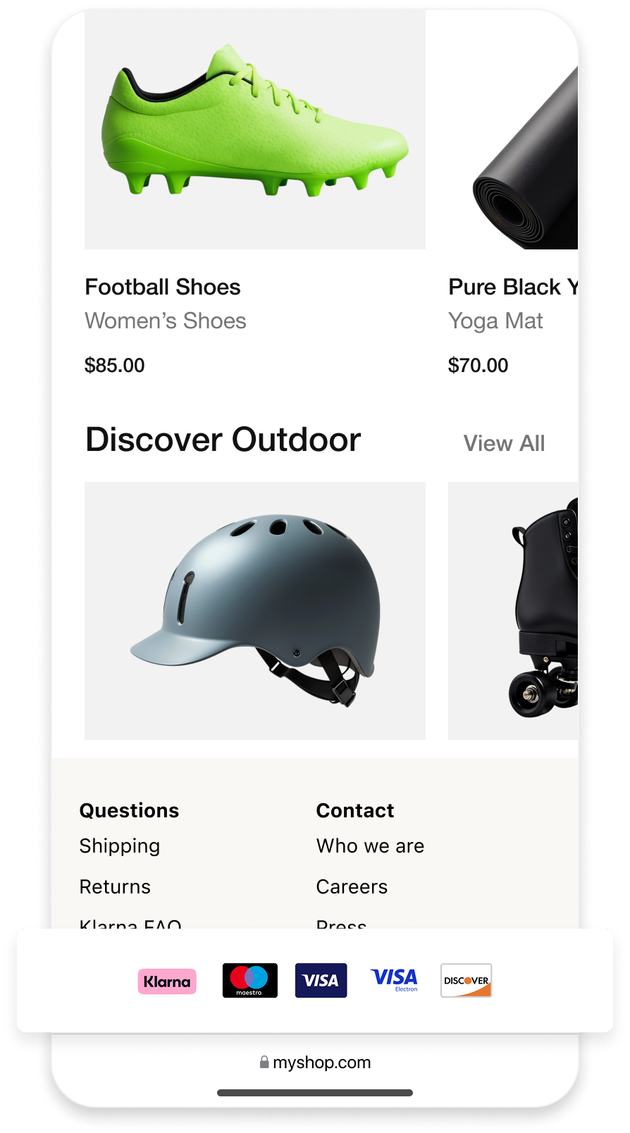 | 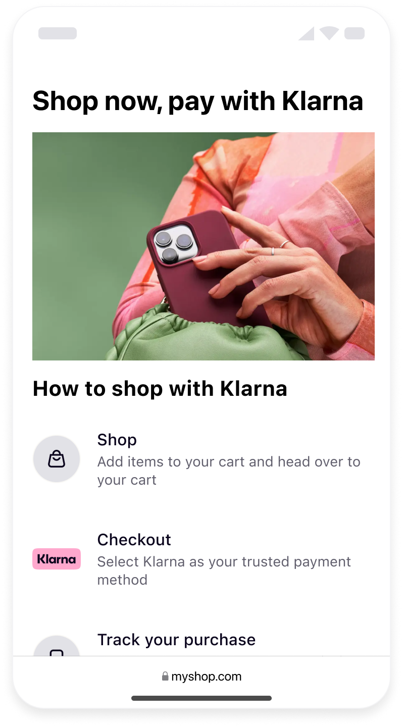 |
| Top strip site-wide | Footer site-wide | FAQ page |
Each placement has an unique key that should be used in order to specify the placement to be displayed. A small HTML snippet should be created to pass the necessary attributes.
| Placement types | Options |
|---|---|
top-strip-promotion-auto-size | Recommended as static asset at the top of the pages of the online store. Displays interactive Klarna messaging. Customers can click on it and expand the information on the payment methods. Mentions Klarna inline as part of the text. |
top-strip-promotion-badge | Recommended as static at the top of the pages of the online store. Displays interactive Klarna messaging. Customers can click on it and expand the information on the payment methods. |
footer-promotion-auto-size | Recommended static asset at the bottom of every page of the online store showcasing the payment methods offered via Klarna. |
info-page-auto-size | Displays a FAQ to clarify common questions about buying with Klarna. The FAQ is dynamic based on the configuration and offered payment methods. |
Product and Cart placements
Personalized messages tailored to the total value in cart or product page, highlighting Klarna's best available payment options to drive confidence and conversion at key decision points. |}
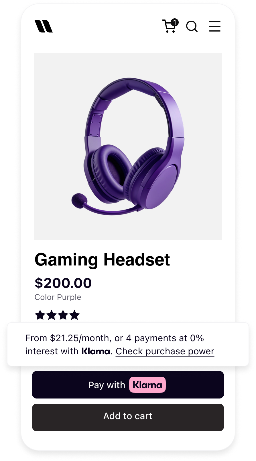 | 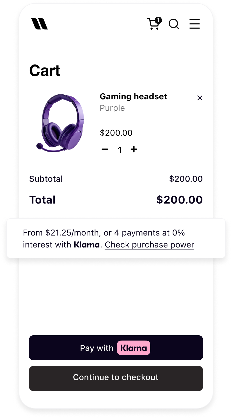 |
| Product detail page with On-site Messaging | Cart page with On-site Messaging |
Each placement has an unique key that should be used in order to specify the placement to be displayed. A small HTML snippet should be created to pass the necessary attributes.
| Placement types | Characteristics |
|---|---|
credit-promotion-auto-size | Displays interactive Klarna messaging. Customers can click on it and expand the information on the payment methods with calculated prices. Mentions Klarna inline as part of the text. |
credit-promotion-badge | Displays interactive Klarna messaging. Customers can click on it and expand the information on the payment methods with calculated prices. Displays Klarna's logo in svg, |
On-site Messaging placements allow Partners to display Klarna payment options and promotions at key points in the customer journey (for example, product, cart, or site wide). This increases customer awareness of flexible payment options and can boost conversion rates.
Customize Placements with CSS
On-site messaging renders its content within a shadow DOM to prevent the styles from being accidentally applied to the pages that host the placements. This ensures that the styles on the host pages do not interfere with the content of the on-site messaging
HTML
1
2
3
4
5
6
7
8
9
10
<klarna-placement data-key="credit-promotion-auto-size" data-locale="en-GB" data-purchase-amount="20000"
data-theme="default" data-message-preference="klarna" >
#shadow-root
<div part="osm-container" data-testid="credit-promotion-auto-size" class="container default auto-size">
<div style="height: auto; width: 100%; display: inline-block;"
class="loaded default credit-promotion-auto-size">
<p part="osm-message" class="text osm-message">
Pay with Klarna.
<span class="logo" part="osm-logo">
<span class="logo" part="osm-logo">Klarna</span>Informational modal styling unsupported
Styling of informational modal that appears after a customer clicks a click-to-action button is not supported. As this area is dedicated to informing customers about the financial services provided by Klarna.
Klarna does not offer support for custom styling the informational modal that appears after a customer clicks a click-to-action button. As this area is dedicated to informing customers about the financial services provided by Klarna, Klarna's own branding must be maintained.
CSS Styling Guidelines
- To add the CSS styling, access to the source code of the website is required.
- Klarna recommends adding an
idto theklarna-placementelement to make it easier to target the elements for styling. This allows customization of the appearance of the placements without affecting the rest of the page. - Partners are responsible for ensuring that styling the on-site messaging with CSS does not compromise the accessibility of the website. For example, the contrast between the message and the background must be sufficient for people with low vision to read the message. Chrome DevTools can help detect any accessibility issues.
Part API
To enable styling of the placements with CSS from outside the shadow DOM, Klarna uses the ::part API to expose certain elements of the placements that can be styled. Only elements of the placement that have the part attribute can be targeted with CSS for styling purposes. This allows customization of the appearance of the placements without interfering with the content within the shadow DOM.
Limitations of Part API
The Part API has some limitations to keep in mind when using the Part API to style the placements.
- An element that does not have a
::partattribute cannot be styled. - Elements that are nested within an element that has the
::partattribute cannot be targeted. For example, the following CSS selector does not work:
CSS
1
2
klarna-placement::part(osm-container) p { ... }
- Elements that have parts cannot be queried via JavaScript. For example, the following code does not work:
CSS
1
2
querySelector('::part(osm-cta)')
Part pseudo-elements
The list of exposed
::part pseudo-elements is shown below:| Pseudo-element | Description | Placement types |
|---|---|---|
::part(osm-container) | The wrapping element of the placements is the container that surrounds the placement. It can be styled with the ::part(osm-container) selector. |
|
::part(osm-message) | The main text of a placement is the primary message that is displayed within the placement. It can be styled with the ::part(osm-message) selector. |
|
::part(osm-legal) | The legal text that appears under the main message in some markets is an important piece of information that must be clearly visible and readable to the customers. It can be styled with the ::part(osm-legal) selector. This text must not be hidden or obscured in any way, as it is required for compliance reasons. |
|
::part(osm-cta) | The button element that triggers the opening of the informational model is the element that the customer clicks on to view additional information about the product or service being offered. It can be styled with the ::part(osm-cta) selector. |
|
::part(osm-link) | Link elements with the <a> tag are the elements on the page that use the <a> tag to create a hyperlink to another location on the web. They can be styled with the ::part(osm-link) selector. |
|
Integration requirement
Do not use CSS to hide Klarna's logo or badge in the placements. Klarna reserves the right to turn off the integration if it abuses this rule, as hiding Klarna brand elements goes against maintaining branding integrity and visibility.
Theme
The theme defines the placement's color. It can be changed by setting the
theme attribute of the chosen placement.The placement's default theme color is white (light). As the
theme attribute is optional, the default theme is applied both when the attribute is set to default or omitted from the source code altogether.HTML
1
2
3
4
5
6
7
<klarna-placement
  id="my-top-strip"
  data-key="top-strip-promotion-auto-size"
  data-locale="en-US"
  data-theme="dark">
</klarna-placement>
Font
The Partner's site font may be used to maintain brand consistency. However, Klarna recommends using a system font or a clean, legible typeface to ensure readability and better alignment with Klarna's brand.
When using a custom font, please avoid italics or any stylistic variations that hinder legibility. While Klarna understands the importance of maintaining visual consistency with the Partner's brand, readability must take priority to ensure alignment with Klarna's messaging standards.
The following examples show how CSS can be used to style On-site messaging placements. The modified elements are: the
font-family of the text to use an externally loaded font, for example, a Google font, and the size of the badge.Top strip promotion badge sample
HTML
1
2
3
4
5
6
<klarna-placement
  id="my-top-strip-badge"
  data-key="top-strip-promotion-badge"
  data-locale="en-US">
</klarna-placement>
HTML code for a
top-strip-promotion-badge placement with an id. Adding the id to the source code makes it easier to target the placement.CSS
1
2
3
4
5
6
7
8
9
#my-top-strip-badge::part(osm-message),
#my-top-strip-badge::part(osm-cta) {
  font-family: 'Roboto';
}

#my-top-strip-badge::part(osm-badge) {
  transform: scale(1.1)
}
Info page sample
HTML
1
2
3
4
5
6
7
<klarna-placement
  id="my-info-page"
  data-key="info-page"
  data-locale="en-US"
>
</klarna-placement>
HTML code for an
info-page placement with an id. Adding the id to the source code makes it easier to target the placement.CSS
1
2
3
4
5
6
7
8
#my-info-page::part(osm-container){
  font-family: 'Roboto', sans-serif;
}

#my-info-page::part(osm-heading) {
  font-family: 'Roboto';
}
Recommended for integration
Please ensure that appropriate and consistent fonts are used when editing styles, in accordance with Klarna's branding guidelines.
Additional customization use cases
The following examples demonstrate various scenarios that may be encountered when styling the placements.
Aligning Klarna badge left or right on the placement.
The following is an example of how to align Klarna's badge left or right on the placement:
CSS
1
2
3
4
5
6
7
8
9
10
/* Left align of the badge */
#my-top-strip-badge-left::part(osm-container) {
flex-direction: row;
}
#my-top-strip-badge-left::part(osm-message) {
margin-left: 14px;
margin-right: 0px;
}
Styling the hover state.
To style the hover state of links or click-to-action buttons to match the look and feel of the website, pseudo-classes can be used as for any link.
CSS
1
2
3
4
#my-top-strip::part(osm-cta):hover {
  color: #ffb3c7;
}
Styling more than one placement on a page.
When multiple placements of the same type are present on a single page, such as multiple
credit-promotion-auto-size placements on a product listing page, classes can be used instead of IDs to target all of the placements at once. For example:HTML
1
2
3
4
5
6
7
8
9
10
<klarna-placement
  class="my-credit-promotion"
  data-key="credit-promotion-auto-size"
  data-locale="en-US"
  data-purchase_amount="14900">
</klarna-placement>

<klarna-placement
  class="my-credit-promotion"
data-key="credit-promotion-auto-size" Example with the use of classes instead of ids.
CSS
1
2
3
4
.my-credit-promotion::part(osm-container){
  background-color: #E8F3D6;
}
Styling the same placement differently.
When the same placement type is used in different areas of the website, for example, on the checkout page and on the product page, but styled differently in each, use a different id or class for each
klarna-placement element to target the element and apply the desired styles to each.HTML
1
2
3
4
5
6
7
8
9
10
<!-- Product page -->
<klarna-placement
  id="product-placement"
  data-key="credit-promotion-auto-size"
  data-locale="en-US"
  data-purchase_amount="14900">
</klarna-placement>

<!-- Checkout page -->
<klarna-placement Example with the use of classes instead of ids.
CSS
1
2
3
4
5
6
7
8
9
10
#checkout-placement::part(osm-message) {
  color: #fff;
}

#checkout-placement::part(osm-cta) {
  color: #fff;
  background: #007bff;
}

#product-placement::part(osm-message) {Styling placements for different viewports.
The messaging style can be adjusted based on the screen size, such as using a smaller font on mobile devices and a larger one on desktop displays.
CSS
1
2
3
4
5
6
7
8
9
10
/* Extra small (mobile) styles */
@media (max-width: 575px) {
#my-top-strip::part(osm-message) {
font-size: 12px;
}
}
/* Small devices (mobile landscape) styles */
@media (min-width: 576px) and (max-width: 767px) {
#my-top-strip::part(osm-message) {Jump to section...