

Perfect Customer Journey
Create a smooth and high-converting experience by following UX guidelines that cover every step of the Klarna Purchase Journey, from awareness to post-purchase, with best practices for consistent, effective integration.
10 min read
Klarna end-to-end customer journey
Deliver a fast, flexible, and trusted shopping experience for 100 million Klarna customers. By following these UX best practices, Partners can unlock the full potential of the Klarna integration, boosting checkout conversion, increasing customer satisfaction, and driving higher average order values. Partners who implement Klarna using these guidelines see faster checkouts, more returning users, and fewer abandoned carts.
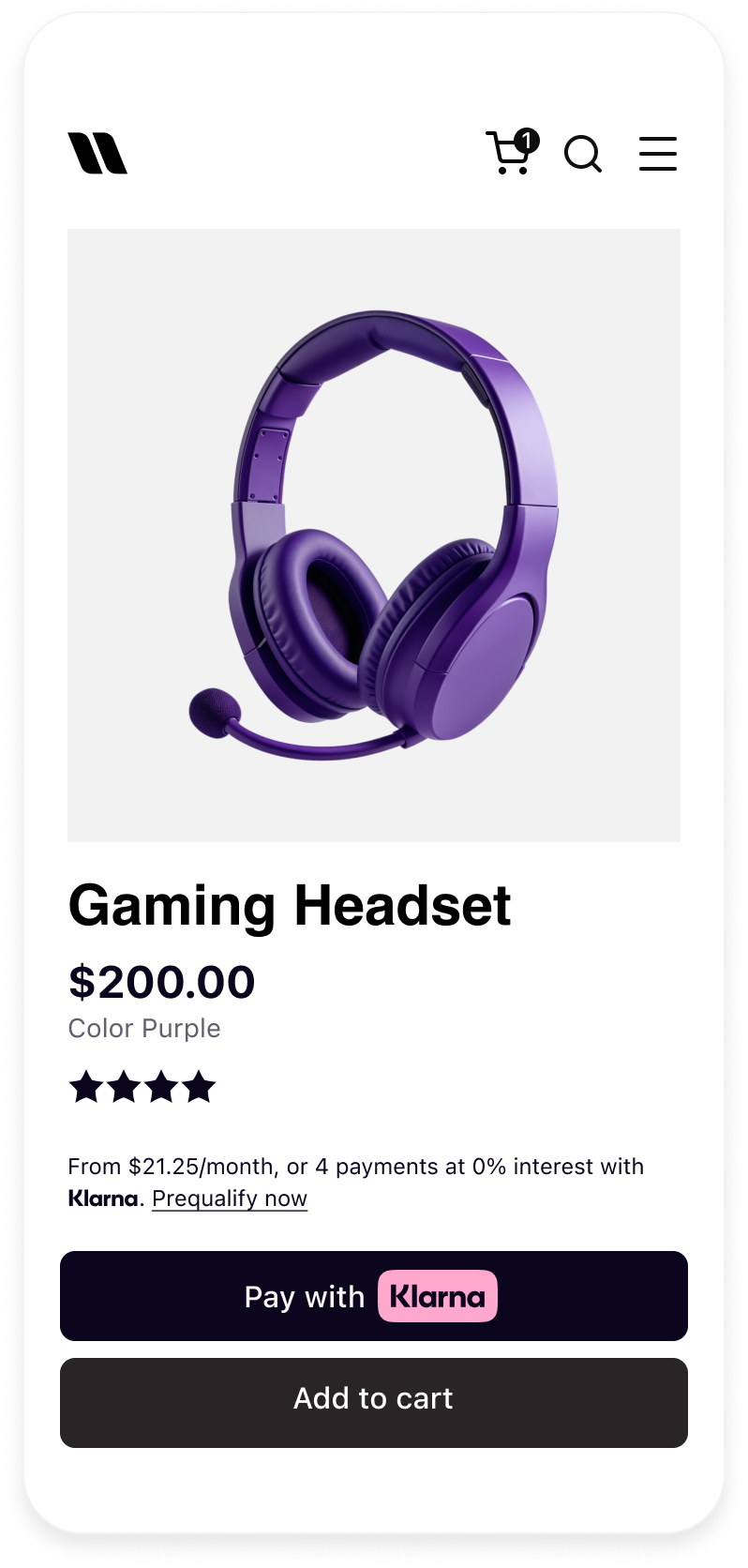 | 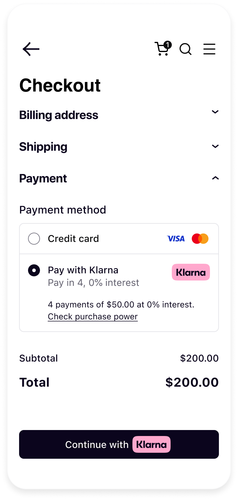 | 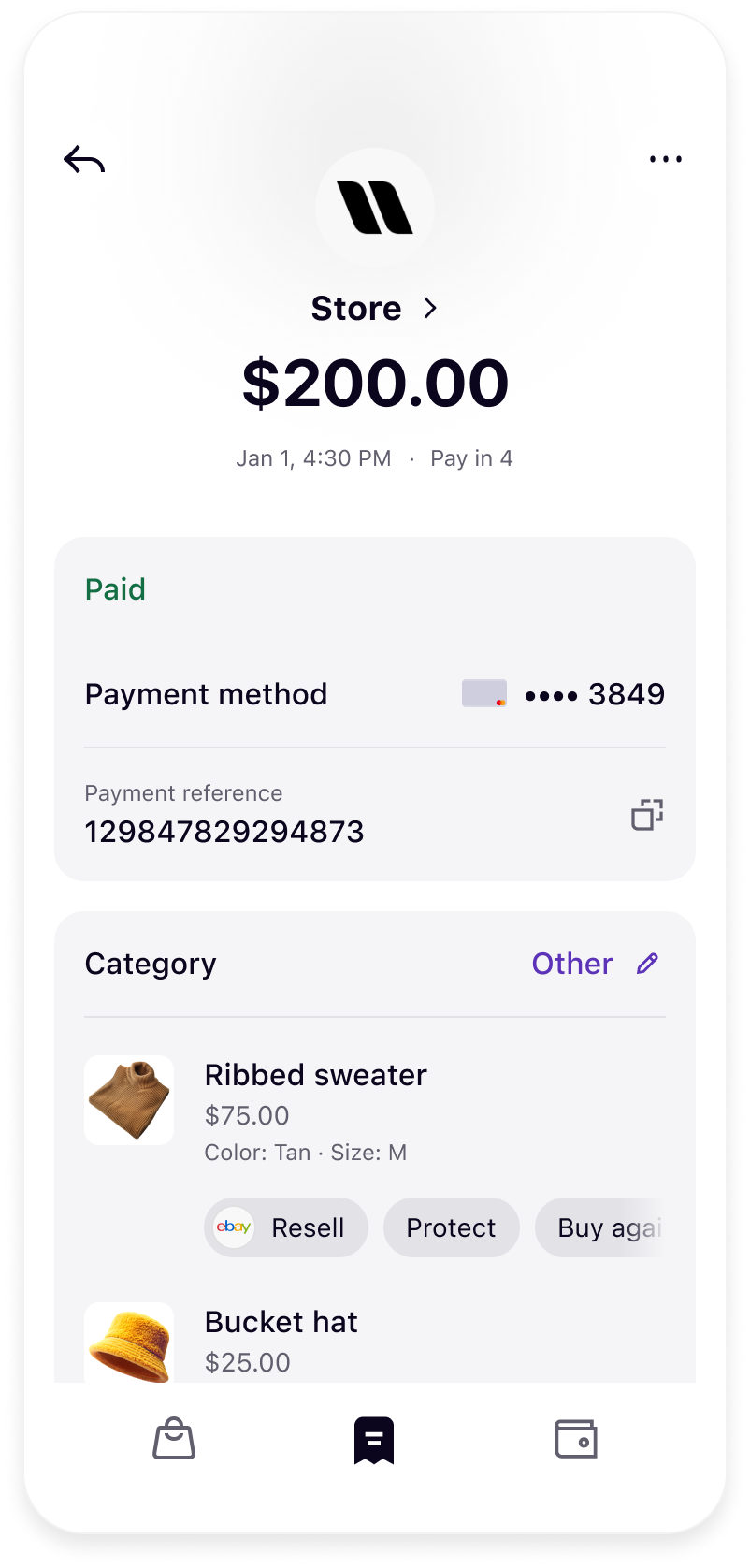 |
| On-site messaging and Express checkout on product page | Klarna presentation in Checkout | Post-purchase details in Klarna app transaction page |
From the homepage to product detail pages, cart, checkout, email communications, and post-purchase interactions, Klarna tools like On-site messaging, Sign in with Klarna, Express checkout, and Checkout Presentation serve as powerful enablers. These features support users at every phase, building trust, simplifying access, and removing friction where it matters most.
Homepage
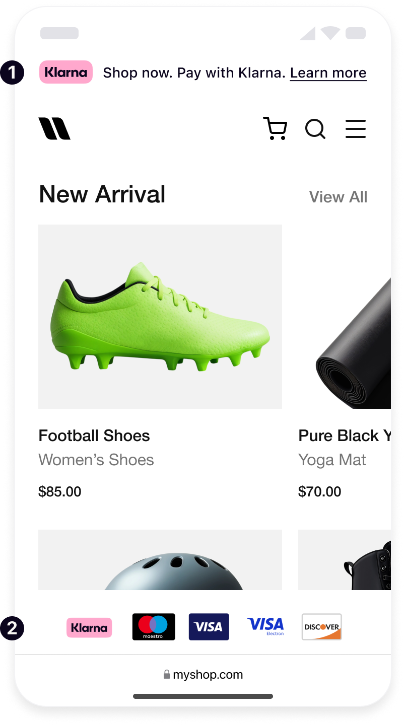
Site-wide banners
Let customers know about their payment options as early as possible using Klarna's banners to drive conversion and AOV.
- 1.Banner: Place a banner at the very top of the site using On-site messaging so every visitor instantly sees the flexible payment option to increase awareness as soon as the customer arrives. Apply it at the following touch-points for highest impact: homepage, site wide or sidebar.
- 2.Payment Method Footer: In the footer of every page, display the official Klarna logo alongside other payment icons using On-site messaging. This fosters trust by showing Klarna as a visible, transparent payment option throughout the Klarna Purchase Journey.
Klarna FAQ or Info Page
Reduce friction and enhance customer confidence by integrating Klarna's dynamic FAQ landing page into the site using On-site messaging. This resource provides clear, localized information about how Klarna works, empowering customers to make informed decisions with less hesitation. For maximum visibility, Klarna recommends adding a link to this page in the site's footer, where users naturally look for support or payment details.
Key benefits include:
- Messaging tailored for each market
- Always compliant with local regulations
- Contributes to reducing errands By proactively answering common questions, the FAQ page helps streamline the Klarna Purchase Journey and supports higher conversion rates.
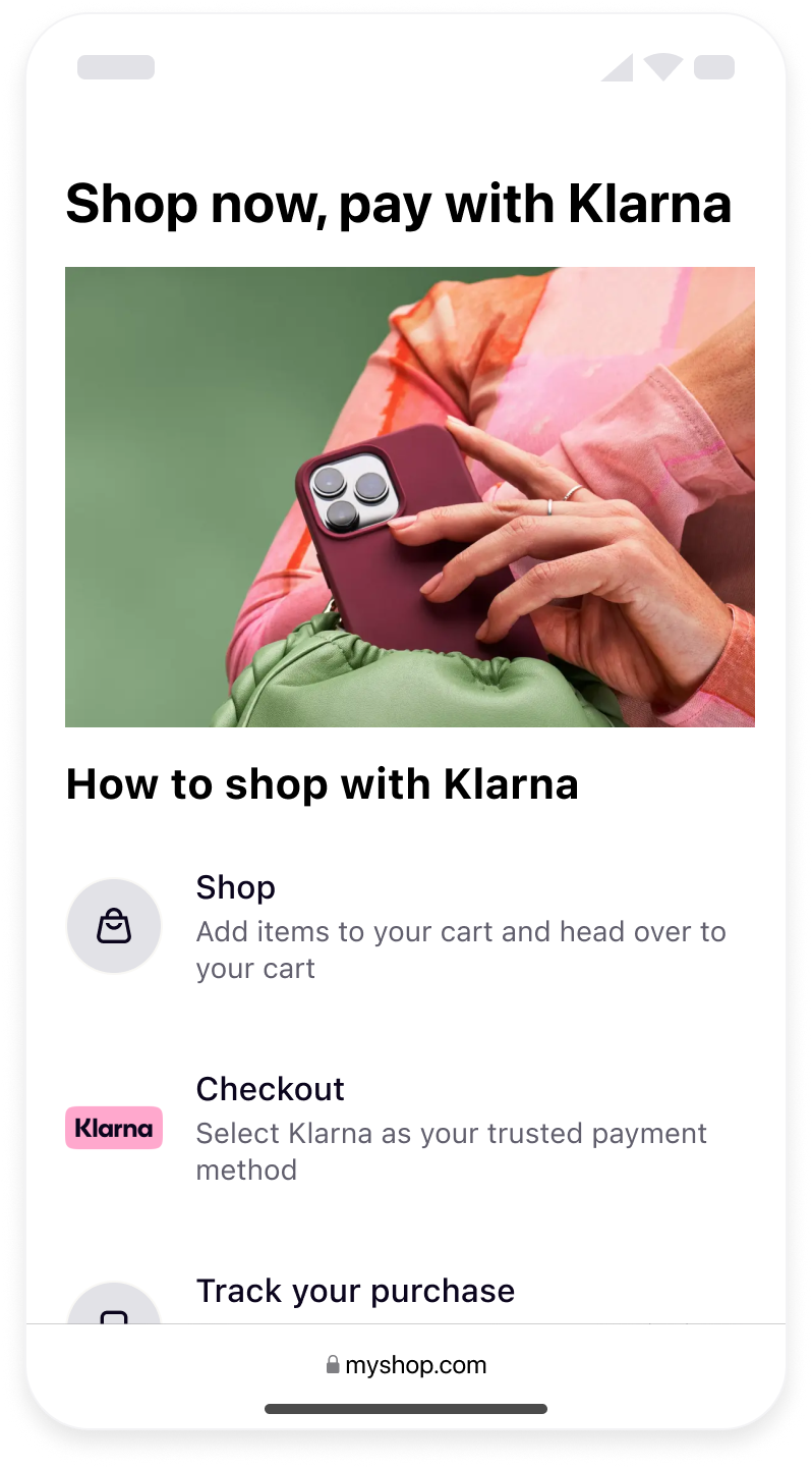
Social Login using Sign in with Klarna
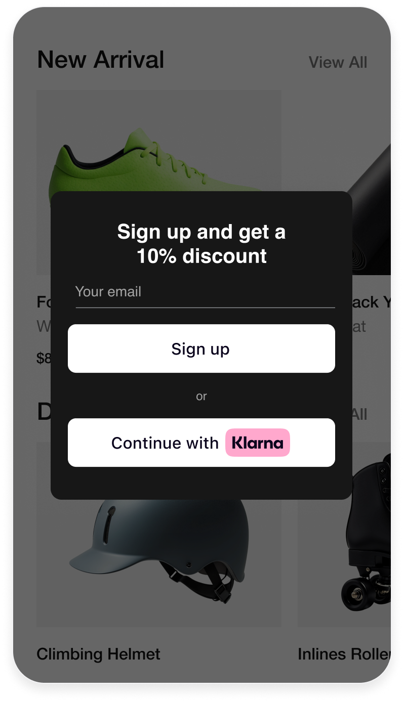
Sign in with Klarna allows users to authenticate using Klarna credentials, reducing friction and pre-filling personal details at checkout. It also gives Partners access to user data, helping pre-fill key parts of the experience and therefore expediting the checkout process multiple times.
The Sign in with Klarna button should always be placed wherever account creation, login options or other social logins are provided:
Place the Sign in with Klarna button prominently as a quick-start method.
- Home - promote registration to the site early in the customer journey.
- Login - for returning registered users, allow them to quickly log in again.
- Register pages - leverage additional touch points such as the confirmation page after a purchase to promote registration.
Product page
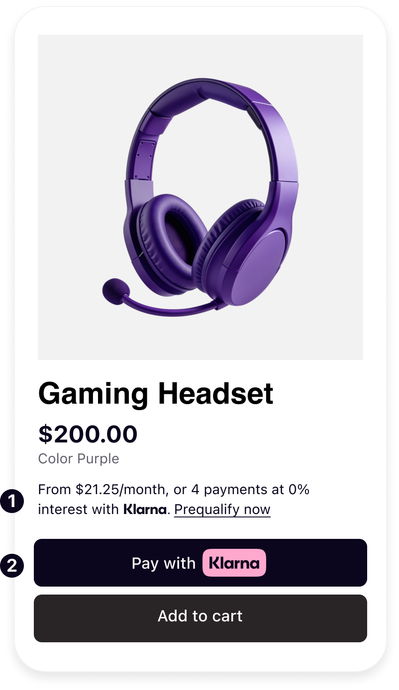
Increase customers' perceived spending power by creating awareness of Klarna as a payment option on the product detail page. Integrate Klarna's On-site messaging so that the price and payment options are considered together, and utilize the Express checkout button to enable a one-click checkout.
- 1.On-site messaging: Place Klarna's dynamic messaging widget directly beneath the product price. This widget dynamically shows a tailored pay-later offering (for example, "Pay €20/month with Klarna" or "Pay in 4 interest-free payments") based on the item price. Make customers aware of their spending power by clearly communicating flexible payment plans, which can increase average order value by ~25% and boost conversion.
- 2.Express checkout: Place the Express checkout button close to the Add to cart button on the product page. Offer returning Klarna users a one-click experience that reduces friction and captures impulse purchases by streamlining the route to purchase and boosting conversion. This is not just fast, it is retention-grade UX. Express checkout reduces checkout time by up to 80%, resulting in:
- 2.1.5X faster transactions
- 2.2.10% to 15% increase in conversion rates
- 2.3.Reduction of bounce rates for mobile-heavy segments (for example, fashion, beauty, lifestyle) Express checkout can make checkout 5x faster than normal.
Cart Page
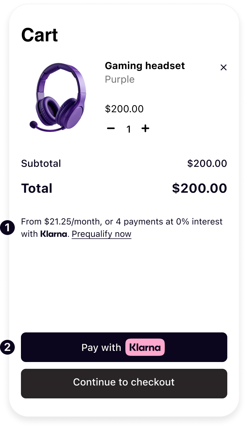
Decrease cart abandonments by reminding customers about flexible payment options at a critical decision-making stage of the customer journey. Use tailored dynamic messaging to communicate payment methods, rewards and offers in a way that is always compliant.
- 1.On-site messaging : Place Klarna's dynamic messaging widget directly near the cart total or order summary. This widget dynamically shows a tailored pay-later offering (for example, "Pay in 4 interest-free payments") based on the item price. Make customers aware of their spending power, which can increase average order value by ~25% and boost conversion.
- 2.Express checkout: Place the Express checkout button below the standard "Proceed to Checkout" button on the cart page. Offer returning Klarna users a one-click experience that pre-fills details and fast-tracks ready customers to complete their purchase with minimal steps.
Checkout Page
Give over 100 million Klarna customers quick access to their preferred payment options. Clear, visible Klarna integration builds trust, reduces drop-off, and boosts conversions. Klarna is to be represented as a single payment option in the checkout. Partners should ensure Klarna is clearly represented, with messaging dynamically retrieved. Four core elements should be kept in mind:
- 1.Klarna logo must be consistent and instantly recognizable across all checkout touch points to reinforce Klarna as a trusted payment method.
- 2.Headers introduce Klarna in the payment form and are dynamically adjusted based on the locale of the customer.
- 3.Message dynamically shows a localized descriptor that presents Klarna's value clearly, helping customers compare options and boosting conversions.
- 4.Payment button well-integrated and recognizable ensures customers understand what happens next, making them feel confident in proceeding with their purchase.
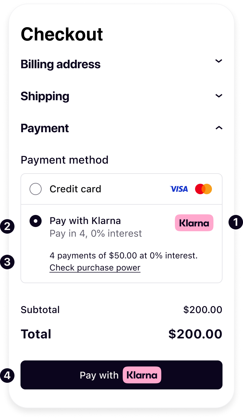
For a high-performing Klarna integration, adhere to the following requirements to make sure Klarna is visible to all customers:
- Increase sales by ensuring Klarna is visible to all customers entering the checkout regardless of the cart size.
- Increase AOV by ensuring Klarna is visible to all customers entering the checkout, including guest and logged-in users.
- Unlock the customer's purchasing power by ensuring that Klarna is pre-selected when a customer that has previously paid with Klarna makes a subsequent purchase.
- Increase sales by ensuring Klarna is visible to customers entering the checkout with a gift card in their cart. Implement Klarna's branding, payment descriptors, and personalized messaging dynamically via Klarna's APIs to ensure accurate, localized, and up-to-date payment options. For more details on retrieving dynamic descriptors, refer to the Checkout documentation.
Confirmation Page and Emails
After a customer places an order using Klarna, it is crucial to continue the consistent experience and provide clarity on next steps. This reduces confusion and post-purchase customer support issues. By handling the confirmation stage in this way, Partners show customers that Klarna is a trusted part of the overall service. Customers are not left wondering about their payment, and they appreciate the seamless communication, making them more likely to shop with the Partner (and use Klarna) again.
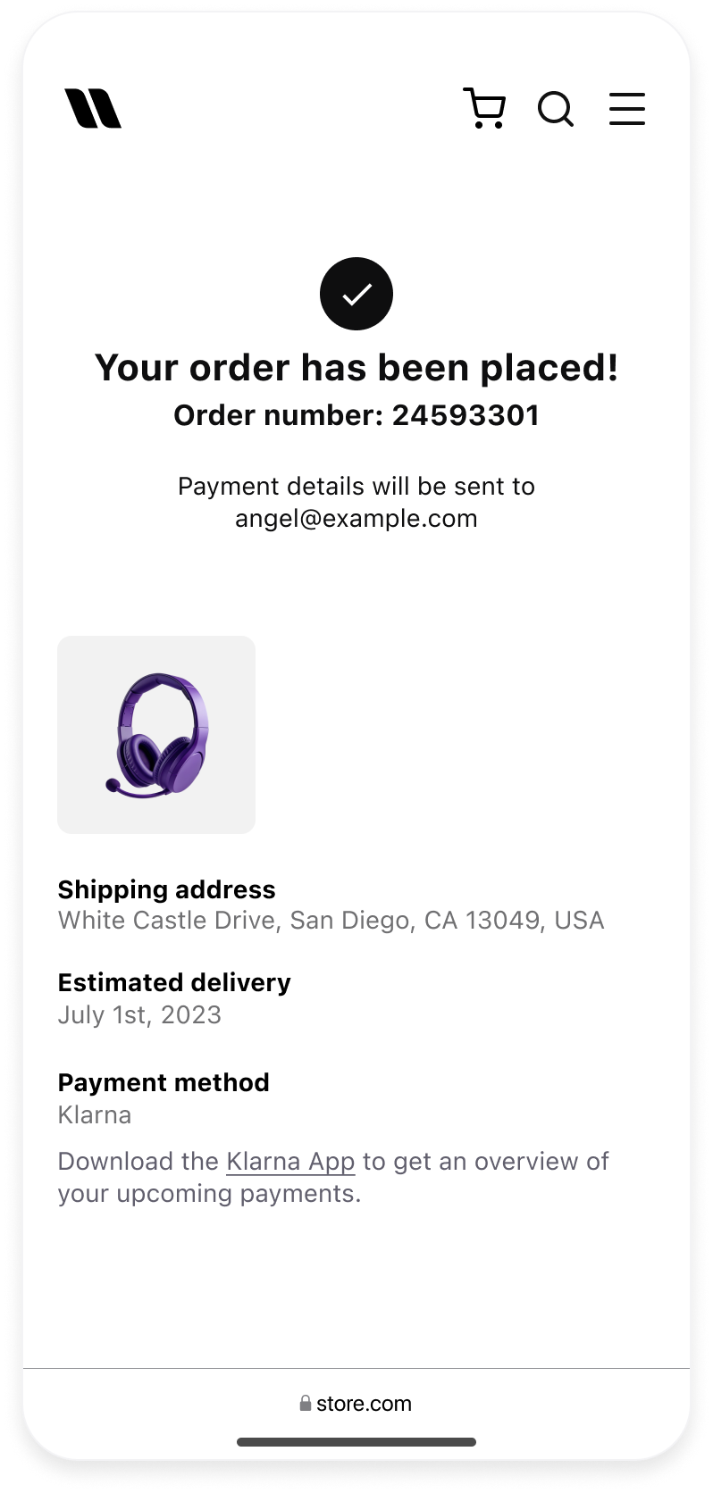 | 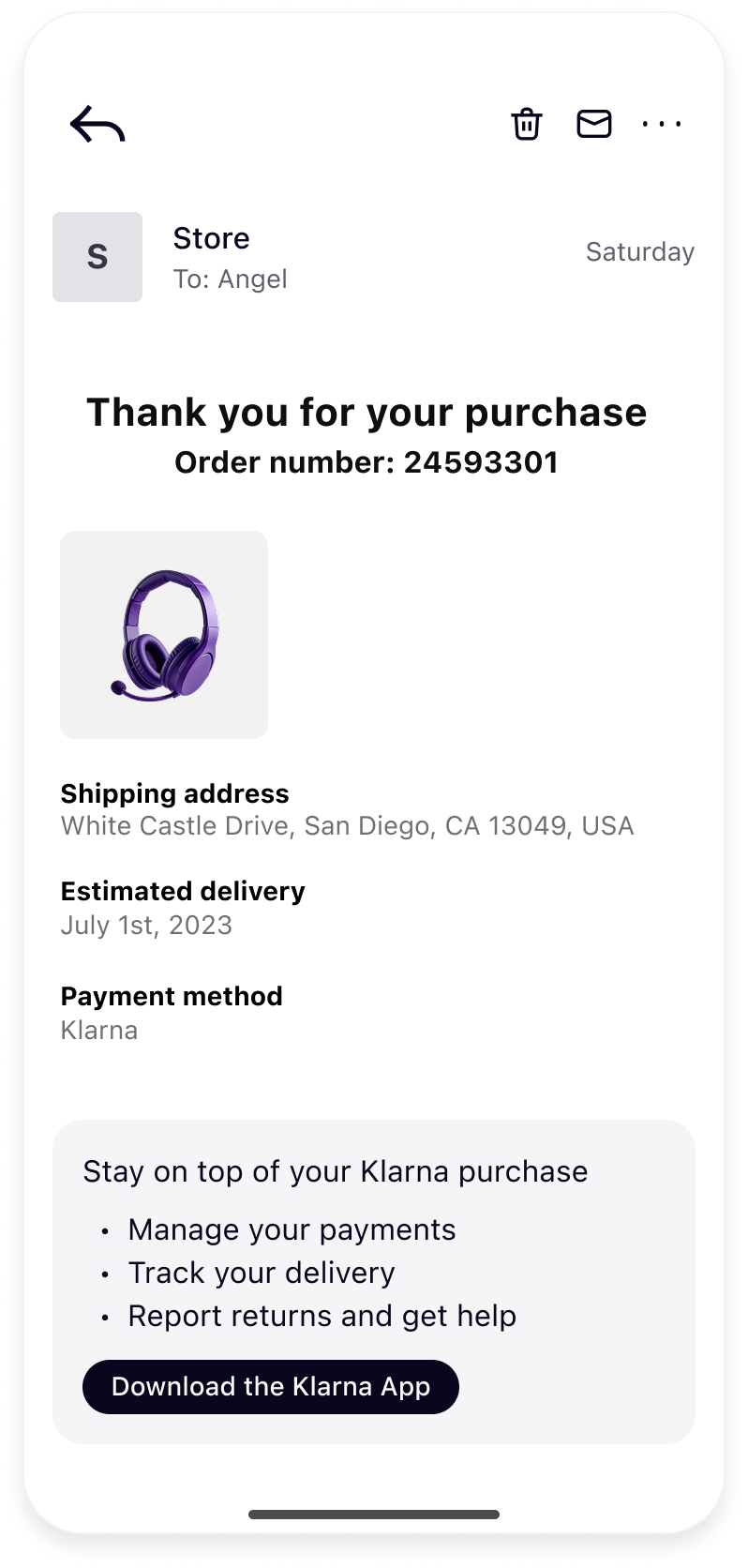 |
| Store's order success page | Store's order confirmation email |
To get it right, follow these guidelines:
- Show Klarna as Payment Method: On the order confirmation page and email, list Klarna as the payment method for the order.
- Explain Next Steps for Payment: Let the customer know what will happen regarding their Klarna payment. For example, a line on the confirmation page or email can say: "You will receive an email from Klarna with instructions on how to pay. Download the Klarna app or log in on Klarna's website to view your payment schedule and manage your payments." Also mention that Klarna's customer support is available for payment-related questions. For instance: "Questions about your payment plan? Contact Klarna's support via the app or at Klarna's help center."
Klarna App's transaction details and delivery tracking
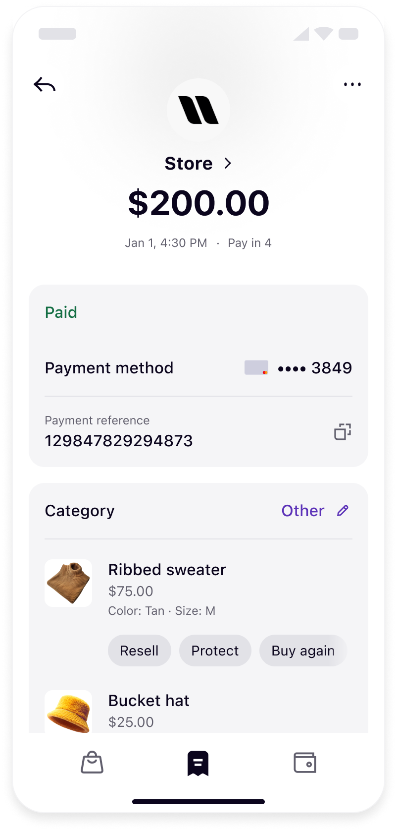 | 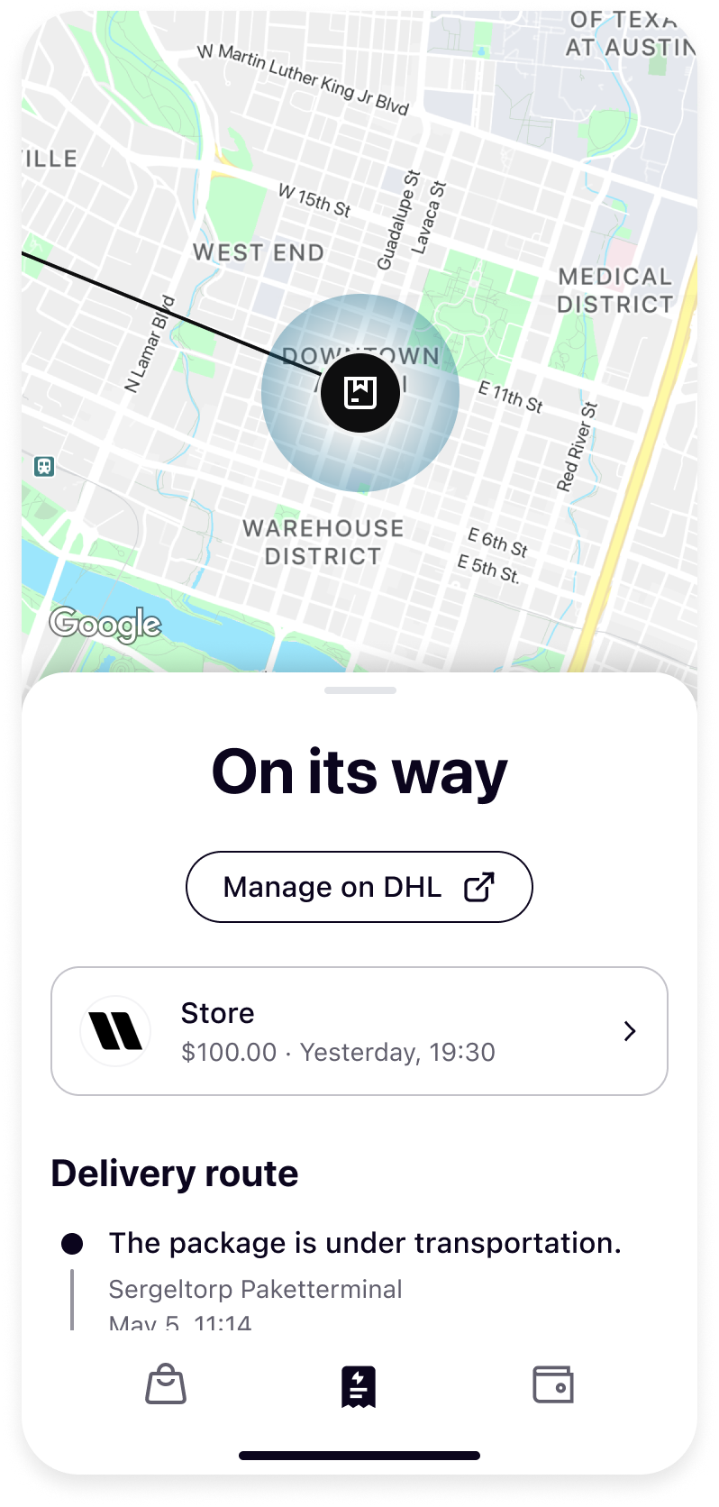 |
| Transaction detail page in Klarna App | Delivery tracking in Klarna App |
- Product Details and Images: Include missing images (URLs) using Supplementary Purchase Data (
line_) to increase repeat purchases and reduce errands. Improve the quality of pictures and get total control of what is shown to end customers.items - Shipping and Tracking Information: Increase traffic from Klarna, reduce errands, and improve the customer experience by passing the carrier name and tracking ID to Klarna via Supplementary Purchase Data (
shipping).
Mobile App Integrations
Coming soon
This will be available in future releases.
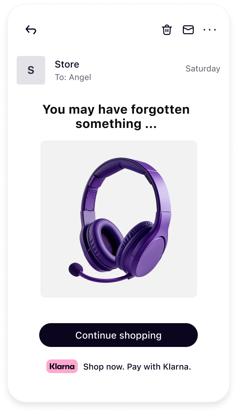
Abandoned cart email
Include Klarna messaging in the abandoned basket email series to remind customers they can still get the items they loved, with the added flexibility of Klarna's installment plans. Clearly highlighting the option to pay over time not only reduces friction at checkout but also builds trust through Klarna's well-established reputation. Customers are significantly more likely to complete their purchase when they know they have a flexible, secure payment solution they recognize and trust. Incorporating this messaging has been proven to drive higher conversion rates and recover more potentially lost sales.
Jump to section...