Let’s deep dive into the best way to present Klarna to your customers.
Let your customers know on your cart page that Klarna payment methods are available and give customers a faster way to checkout with our Express checkout.
On-site messaging: The amount shown is dynamic and will update based on cart total after taxes and any promotions.
Express checkout: Give new customers a faster way to shop by pre-filling their personal details.
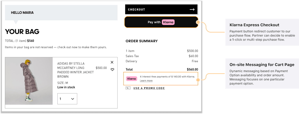
Express checkout helps you uplift conversion and minimize cart abandonment. By pre-filling customers’ details, it allows you to treat your shoppers to a faster, more enjoyable shopping experience.
Express checkout is a free add-on for all partners who use Klarna payments and can be placed at any step of the checkout journey, for example, the product or cart pages.
Business impact
- Over 5x faster than the standard checkout
- 150M customers enjoy a returning shopping experience
Integration details
It's easy to integrate Express checkout. You can find more information here.
Boost confidence and reduce the number of shoppers leaving their basket by showing our flexible payment options before the checkout. The messaging is customized to show the most relevant payment method based on basket size.
Business impact
- 25% Increase in average order value
- 18% lift in revenue per visitor
- 40% Increase in Klarna share of checkout
Integration details
The On-site messaging platform delivers messaging for the best-fit payment method depending on the basket size that the shopper is considering. Find out how it works here.
Payment messaging and Express checkout should be correctly placed on your page for best results. We'll show you what to do and what to not do.
Do's
Place the payment messaging widget, hosted by Klarna, close to the order total so that shoppers can see the full price of their order and the option to spread their cost with Klarna.
Place the Express checkout directly beneath your standard checkout button so that shoppers understand this is a faster way to checkout using Klarna.

Don'ts
Don’t place the Express button away from your standard checkout option, or place the payment messaging widget far from the order total.
Never place the payment messaging away from the order total.
Before going through the different ways Klarna can be displayed at the checkout, let’s review all the assets available at checkout:
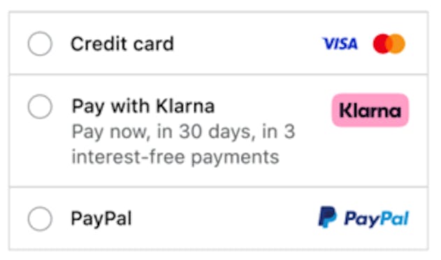
- Payment Descriptor: name of the payment method in merchant checkout, automatically returned by Klarna in the API call.
- Klarna Badge: it is shown next to the payment descriptor.
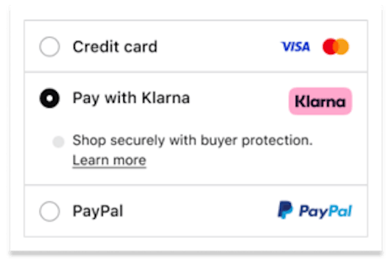
- The Widget: it is loaded below the Payment Descriptor. It can contain banners for Klarna Deals and 0% Financing promotion, and buyers protection information together with learn more.

Example of Checkout assets
Klarna API will respond automatically with corresponding payment descriptor for the market and language indicated by locale parameter in the API request.
Design TIP: based on multiple testing we have found out that mentioning specific payment options directly in your checkout lead to increased conversion.
Klarna Payments solution enables different payments method across all markets, based on the local regulations and other considerations, you may require to present Klarna options in a particular manner.
Our recommended way is presenting Klarna as a unique payment method in your checkout will allow a simplified and a cleaner checkout.
Widget placement
✅ Do’s
The widget should be loaded inline directly below the payment option in the checkout:
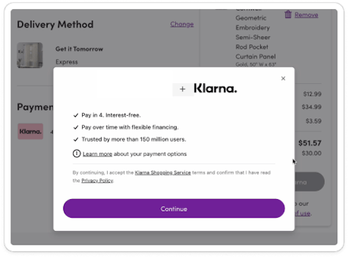
❌ Don’ts
- The widget should not be loaded in a full screen which require customer to take another step:
- Have a different background color than the rest of the checkout:
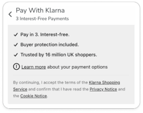
- Avoid create home-built widgets:
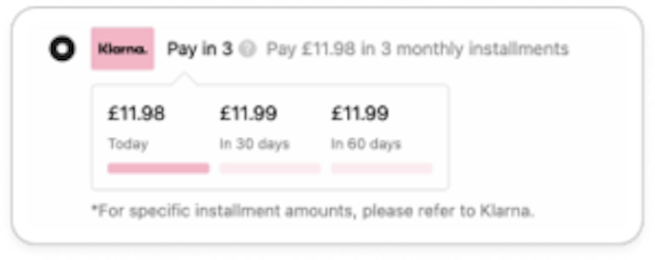
- Avoid relying solely on widget content; instead, incorporate a descriptor following the above guidelines:
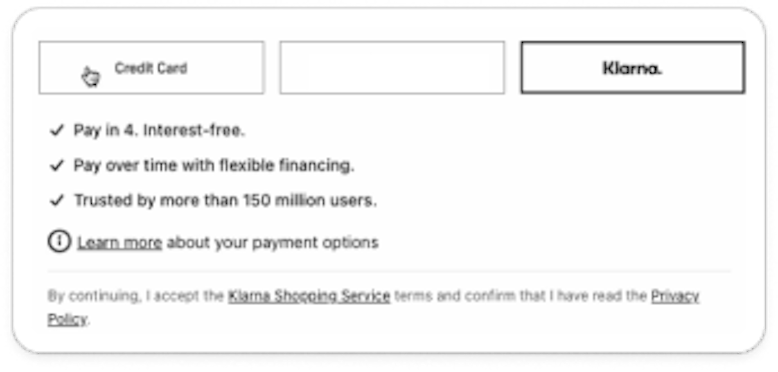
Payment button
✅ Do’s
We recommend changing your payment button to Klarna’s payment button when a customer selects Klarna:
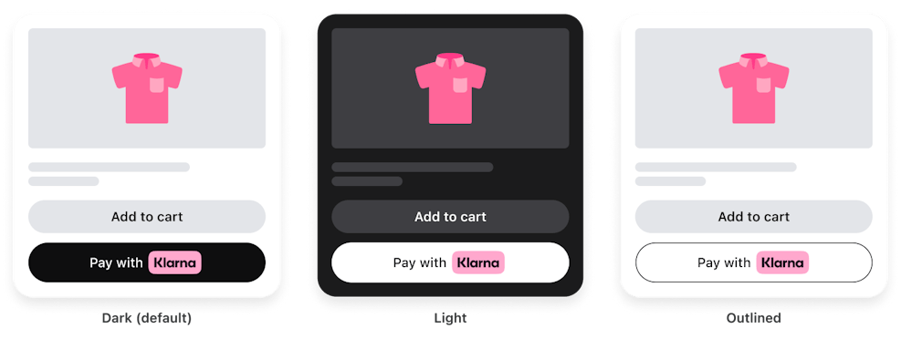
In case you want to keep a consistent payment button across all the payment providers in your checkout, follow these two guidelines:
- Use exactly the same payment button for all the payment providers.
- If you alter the copy of the Payment button depending on payment providers, it's important that you stick with the font that is already used and ONLY update copy to fit with Klarna. Approved copies are:

❌ Don’ts
- Due to compliance reasons, you are not allowed to create a custom copy for Klarna referring to specific payment options:
- Use branding that are outdated or try to mimic our logo:

- Alter the font of the copy in an attempt to mimic Klarna.

Redirection text
✅ Do’s
Redirection is not needed by if you decide to do so, use the following copies:
- "After Clicking “X”, you will be redirected to Klarna"
- "You will be redirected to Klarna"
- "You will be redirected to Klarna to complete your purchase"

❌ Don’ts
Avoid using copies that are dependent on what payment options the customer have like:
- “They will be in touch when your payments are due"
- “You’ll need to provide a debit or credit card to pay for your 4-interest-free payments”
The pink badge creates the most recognition with our checkout badges and should always be used when talking about our benefits within a merchant context.
To dynamically display this badge, listen to the create session response and use the "asset_url" shared in there. In case you are unable to retrieve it from the response, use the following URL to display it:
https://x.klarnacdn.net/payment-method/assets/badges/generic/klarna.svgFor static and alternative options supported and compliance with Klarna branding please see our Brand guidelines
Klarna ensures you stay compliant and up-to-date with data-sharing, terms and conditions, and data protection. If you want to share data with Klarna you need to collect consent in the checkout. Read more about this here.
Give your shoppers the smoothest checkout experience in your native app. Whether your app is fully native or renders content, you can add Klarna Payments using our in-app SDK. In-app SDK offers a broad selection of integration options, making it possible for you to offer all the benefits of a Klarna checkout experience that boosts conversion and saves your shoppers time.
Business impact
- 50% Klarna share of checkout, with higher AOV
- 11% increase in conversion with IOS mobile app shoppers
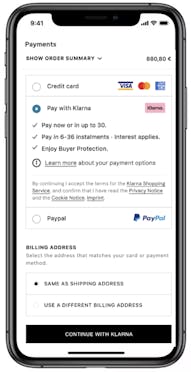
Provide returnUrl when initiating the SDK to optimize interaction with third party app (e.g Bank-ID authentication)
Provide return-Url when initiating the SDK for an improved purchase experience. Here you can find the step-by-step integration guide and documentation.
See it in action
Wanna see how your store could look? Check out our demo store here.