Brand guidelines
Welcome to Klarna's brand guidelines. This section is your go-to resource for understanding and utilizing Klarna's key brand elements, such as our logos and the specifications for creating partner logo lockups. These elements are crucial for maintaining the integrity and consistency of Klarna's brand in your marketing communications.
To find specific information, use the navigation panel on the right. This will help you quickly locate the guidance you need on various topics related to our brand elements.
For comprehensive insights into our branding, including typography, color schemes, and overall art direction, please visit our brand portal.
Find here a creative guide tailored for partner marketing campaigns. Our brand assets are also available in SVG format on our Brand Portal.
Please follow these guidelines to present the value of our partnership in a clear, consistent and impactful way.
Klarna Assets for Checkout page
If you are unable to retrieve the assets via our APIs, you can use the collection of Klarna logos provided here for building the checkout page. For Express Checkout and Sign in with Klarna, please follow their specific guidelines regarding logo usage and variants.
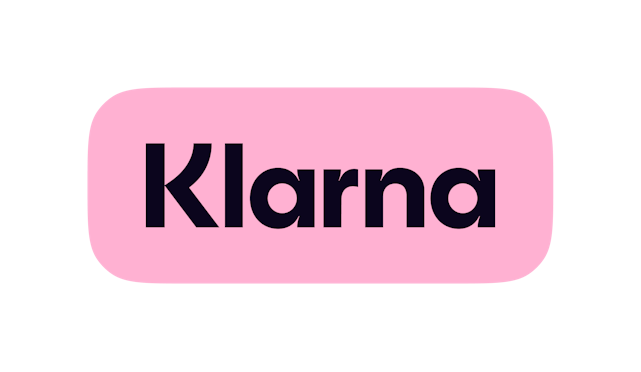
Badge (primary option)
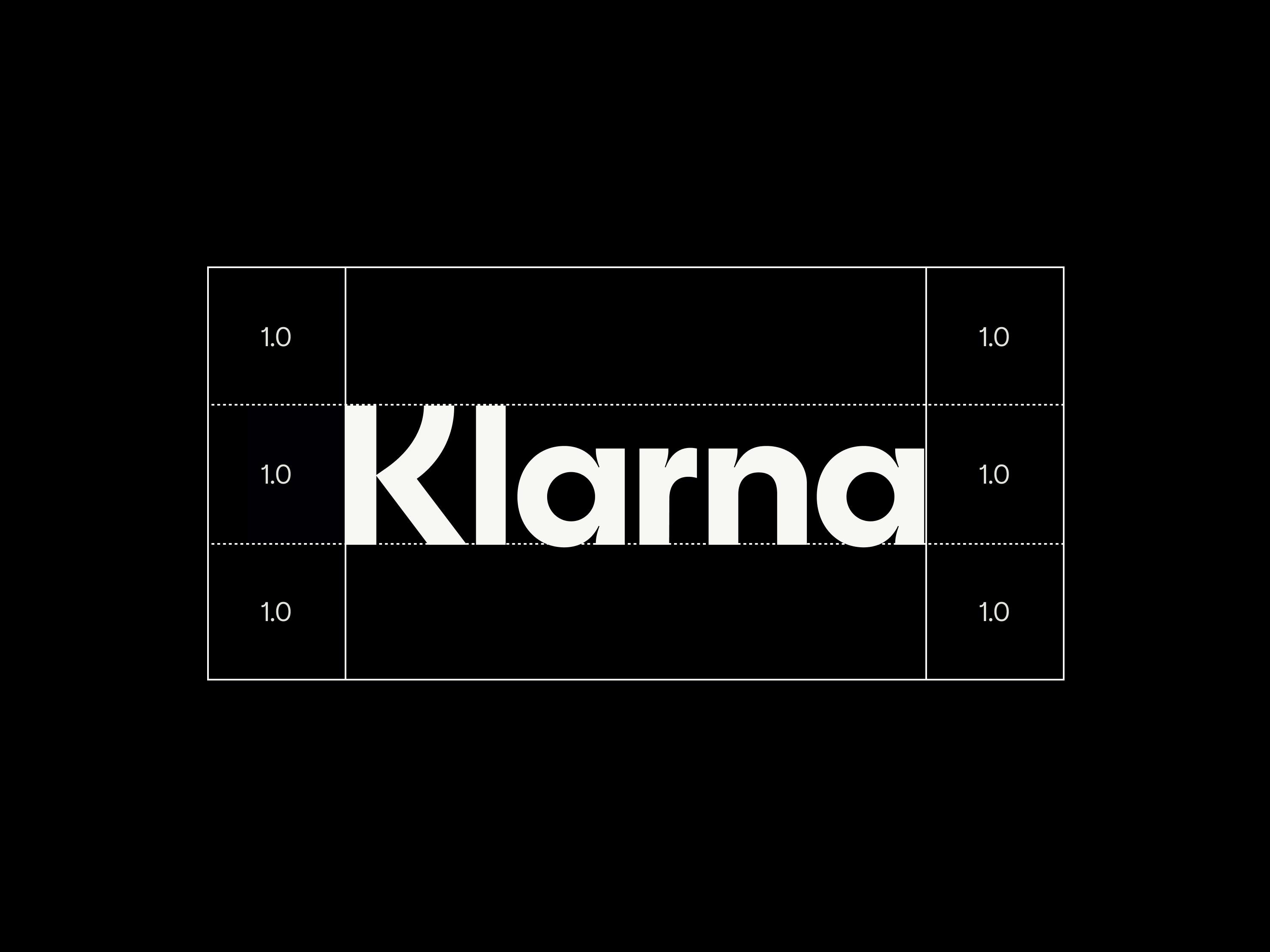
Our eye-catching badge, consisting of our wordmark on Klarna Pink background, is a preferred option for all types of assets. The height of the badge defines the minimum clear space. The clear space can be increased but never decreased.
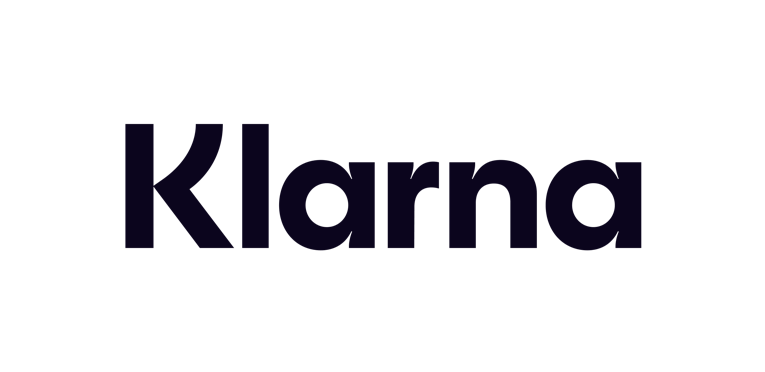
Wordmark (secondary option)
In case it's not possible to use the badge, opt for the wordmark in Klarna Pink, Black and Off White, and no other combination of colors. The height of the logo defines the minimum clear space. The clear space can be increased but never decreased.

Klarna partner logo lockups
Klarna works with many brilliant brands. Our badge and wordmark can be used to help showcase these partnerships. Here are our two main partnership lockups.
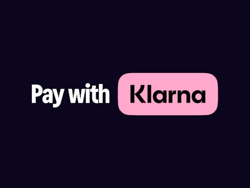
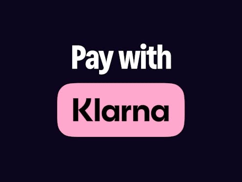
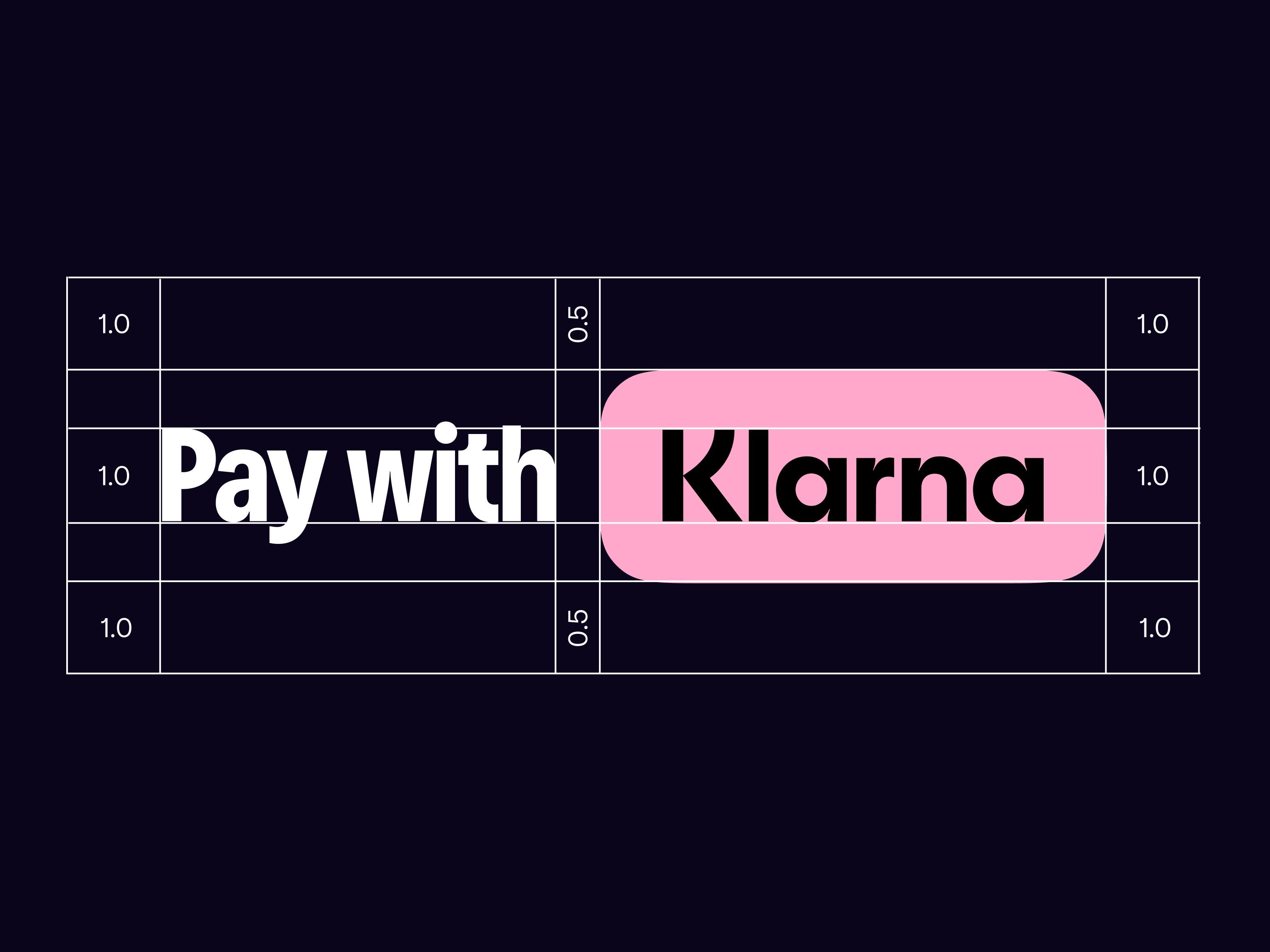
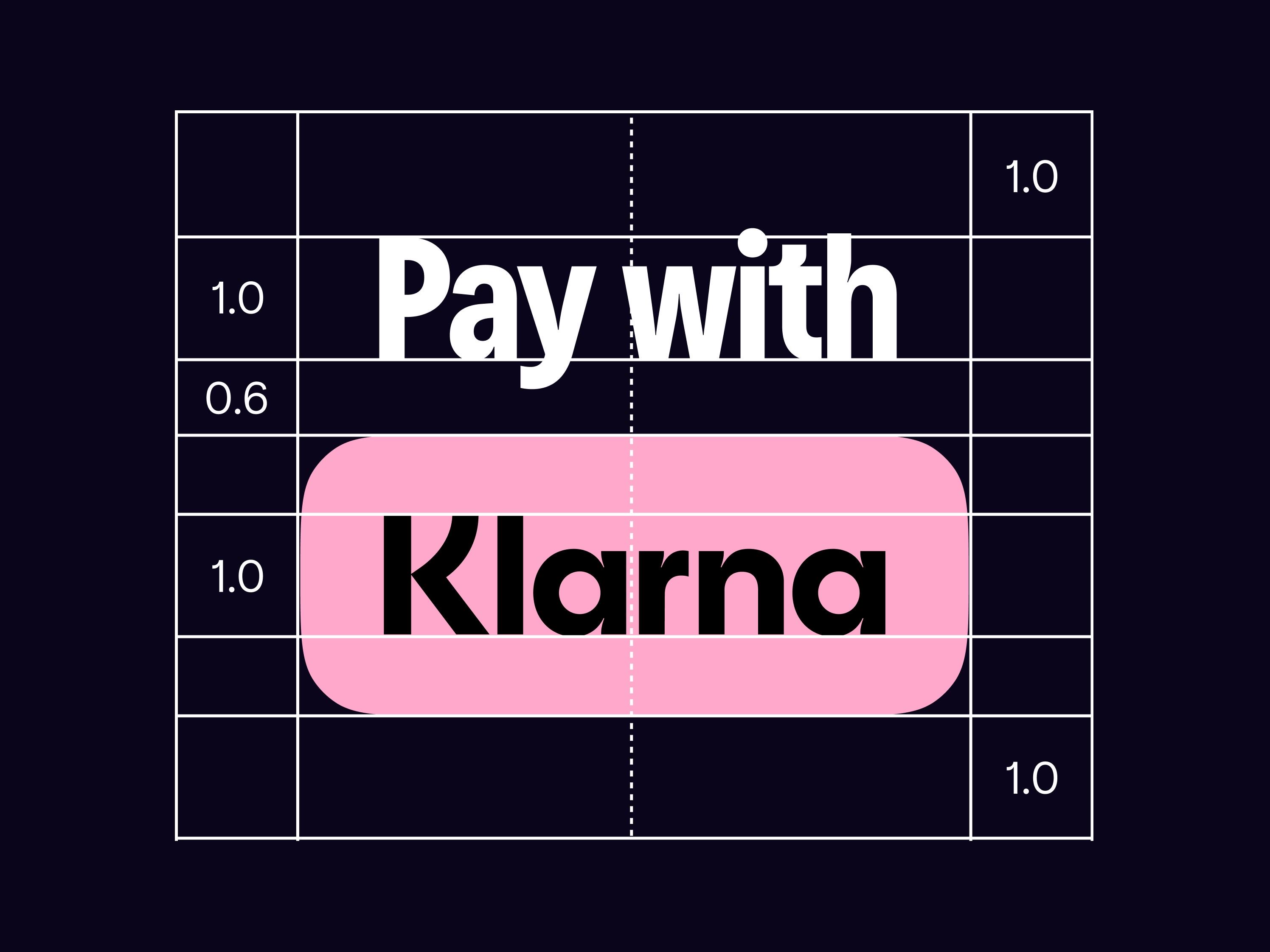
Pay with Klarna lockup (primary option)
This lockup lockup combines our typeface and badge, enhancing your materials with clear, impactful Klarna messaging. It seamlessly fits into your brand, recommended for most uses. Place it under headlines in your brand's font, complementing your imagery and design.
Available in black or white, choose based on background brightness. It's localized in all languages and offers alternative messages like "Pay flexibly with Klarna." or "Pay now or in 30 days with Klarna". Access pre-made advertising assets and select your market to download ready-to-use localized lockup options (as part of the brand kit).
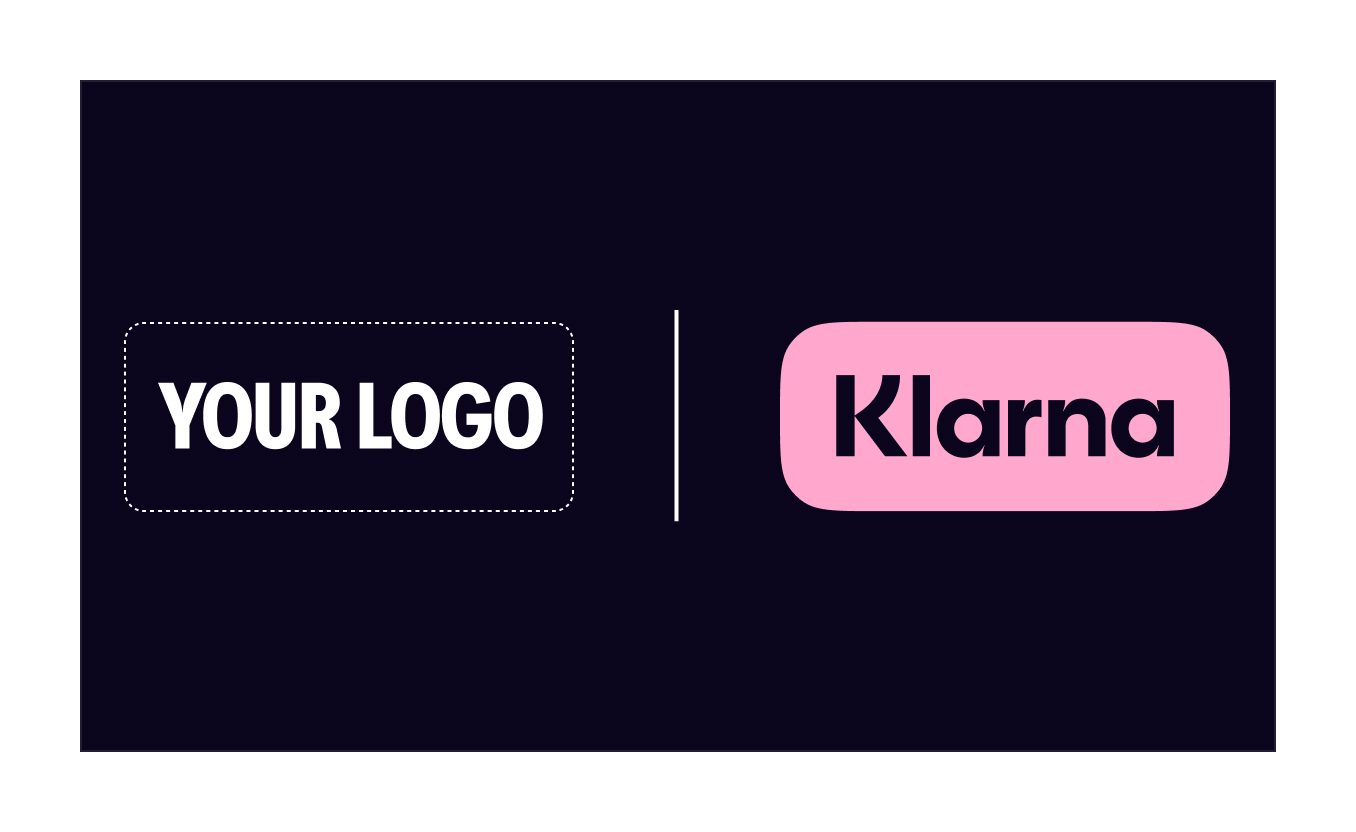
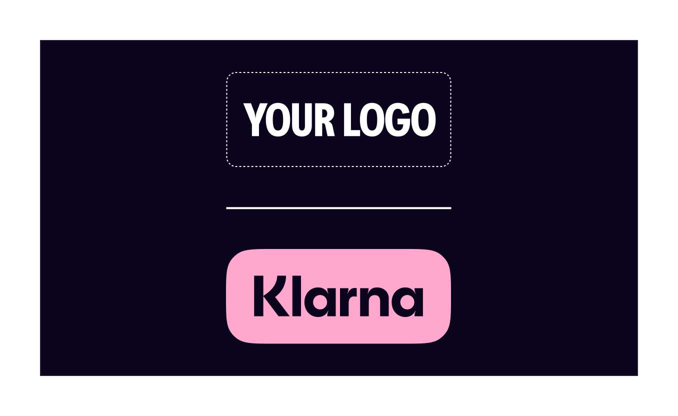
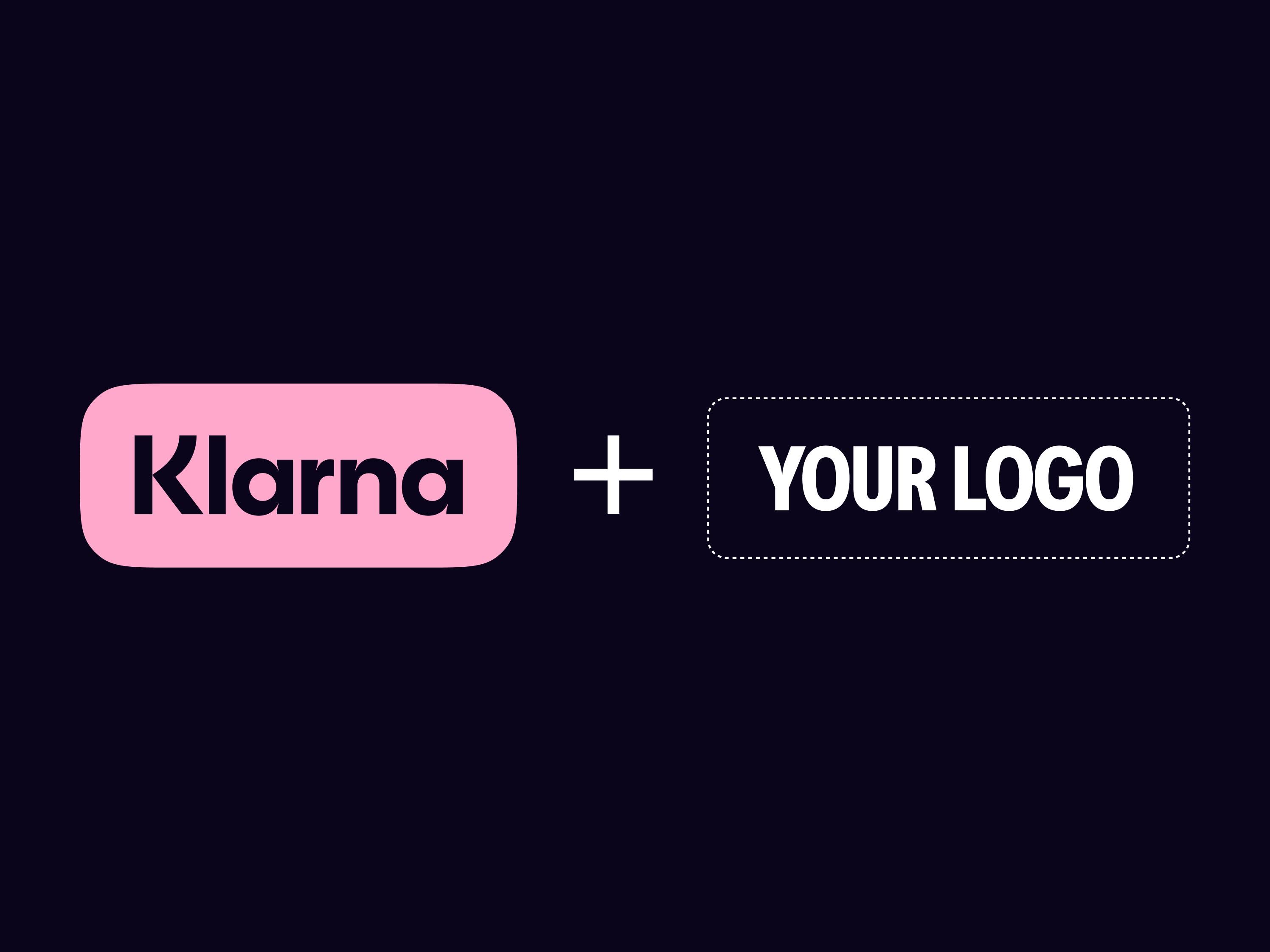
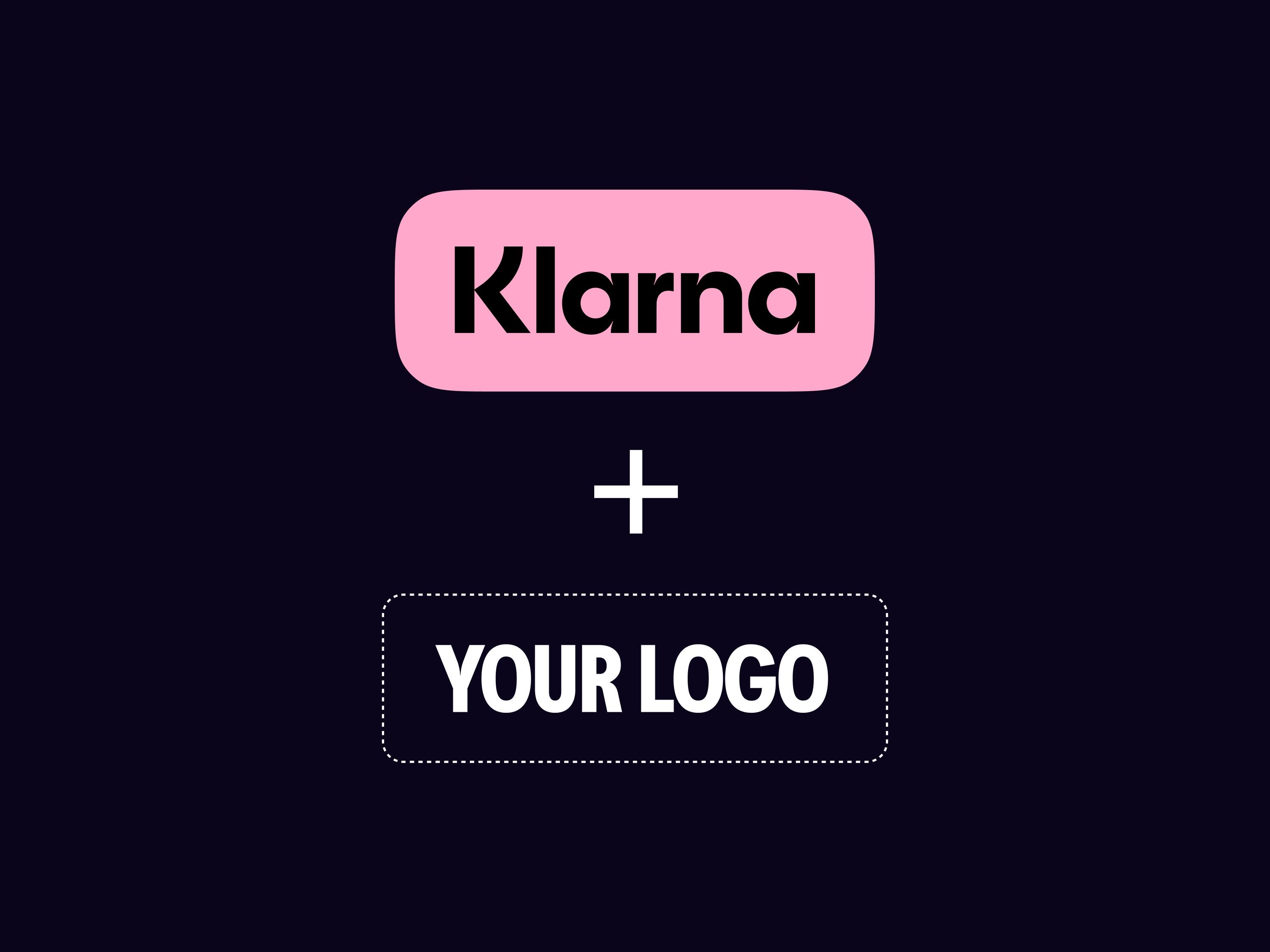
Dual logo lockup (secondary option)
When advertising space is tight you can use this simple and effective option. By combining our two logos, this lockup lets us to show our partnership in a simple, graphic way. We recommend that you always accompany this lockup with a short, impactful Klarna messaging, which you can find in your market's section of the pre-made advertising assets.
Partner first
If you are the sender, your brand controls the look and feel of the communication. You should use your logo in the lead.
Available with both badge and wordmark, in horizontal and vertical formats and in black or white colors, choose the option that suits your layout and background brightness. All available options can be downloaded below.
Klarna first
If Klarna is the sender then the asset will follow our brand guidelines, and the Klarna logo should be in the lead.
Available with both badge and wordmark, in horizontal and vertical formats and in black or white colors, choose the option that suits your layout and background brightness. All available options can be downloaded below.
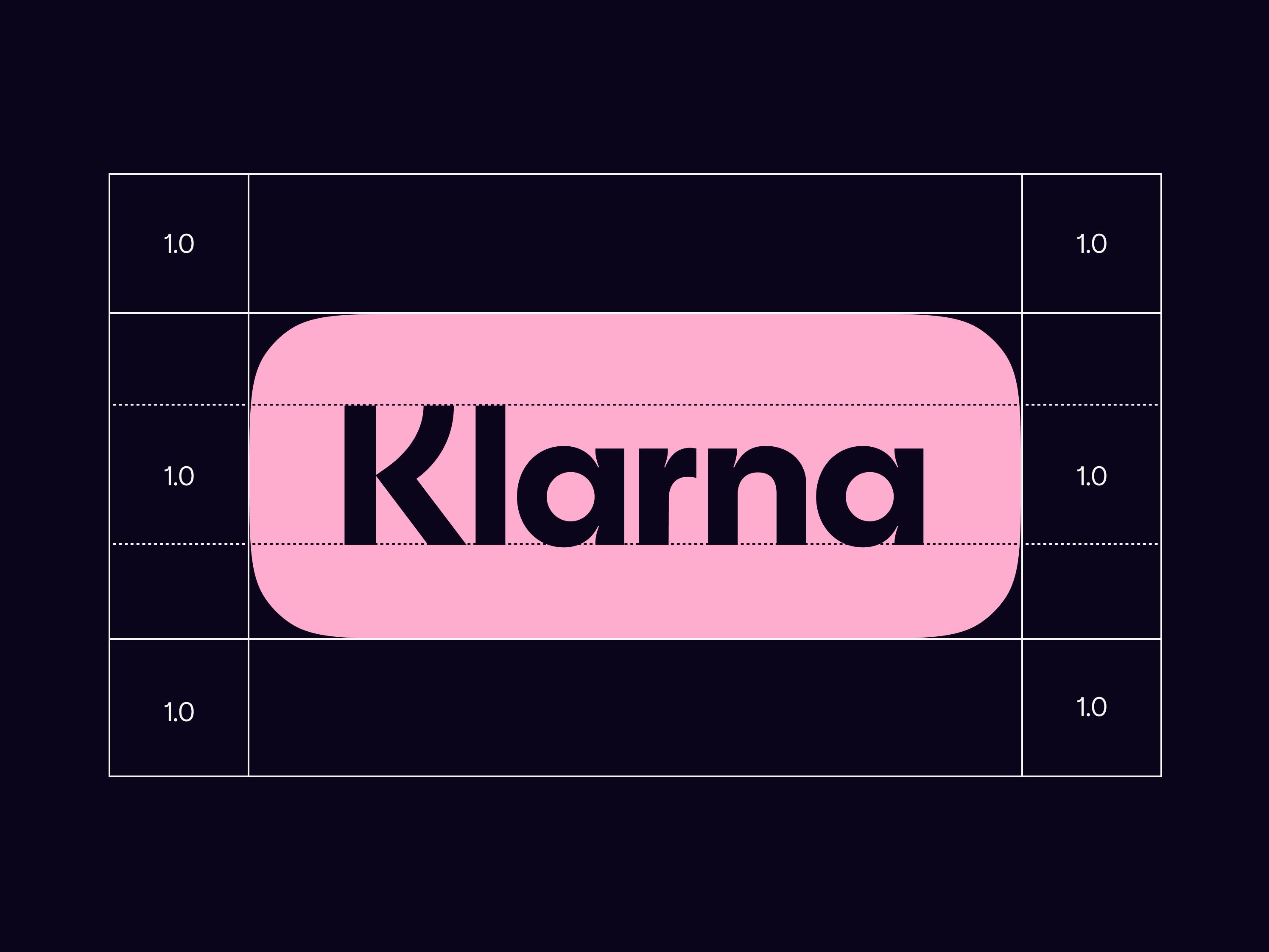
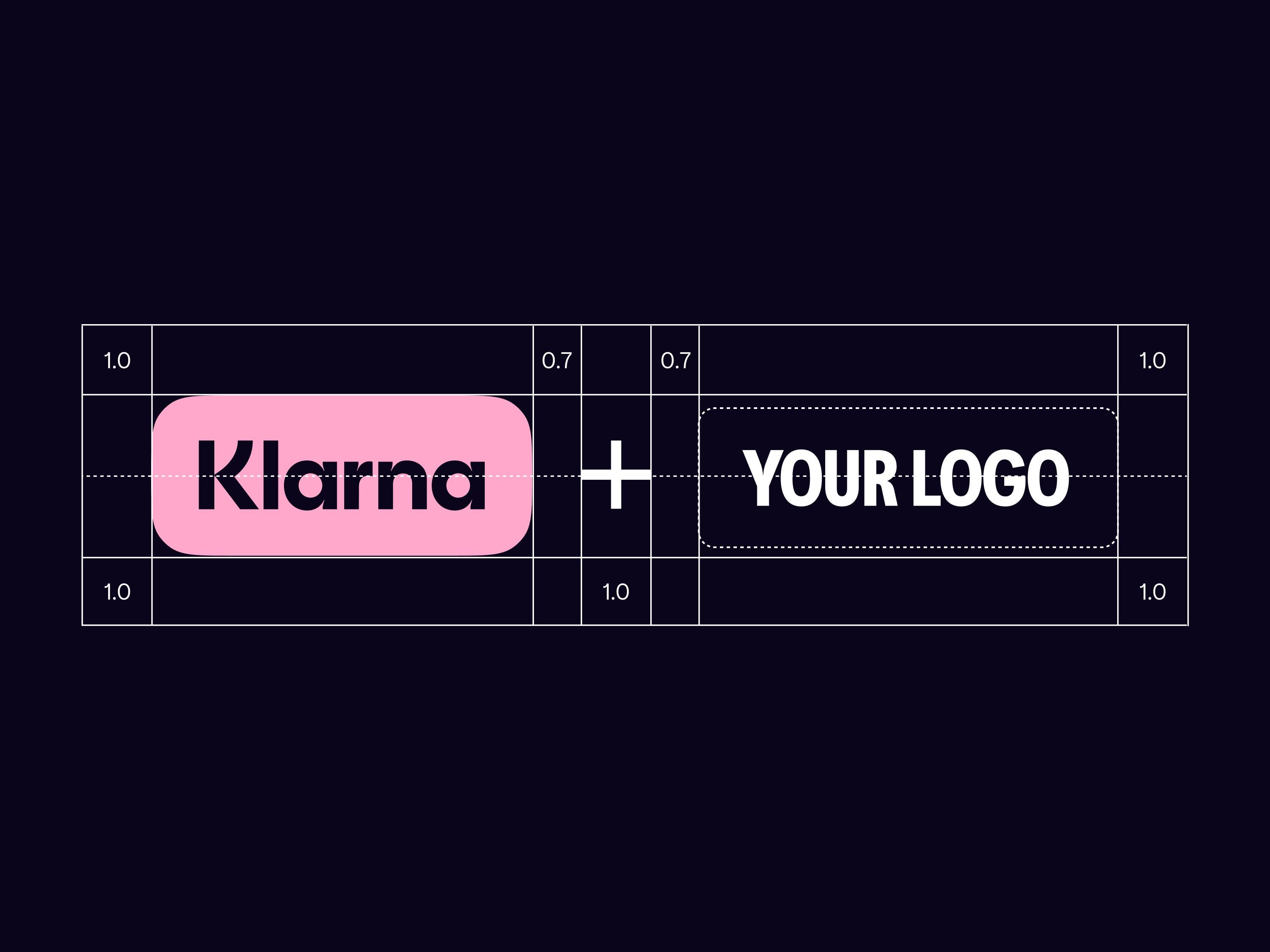
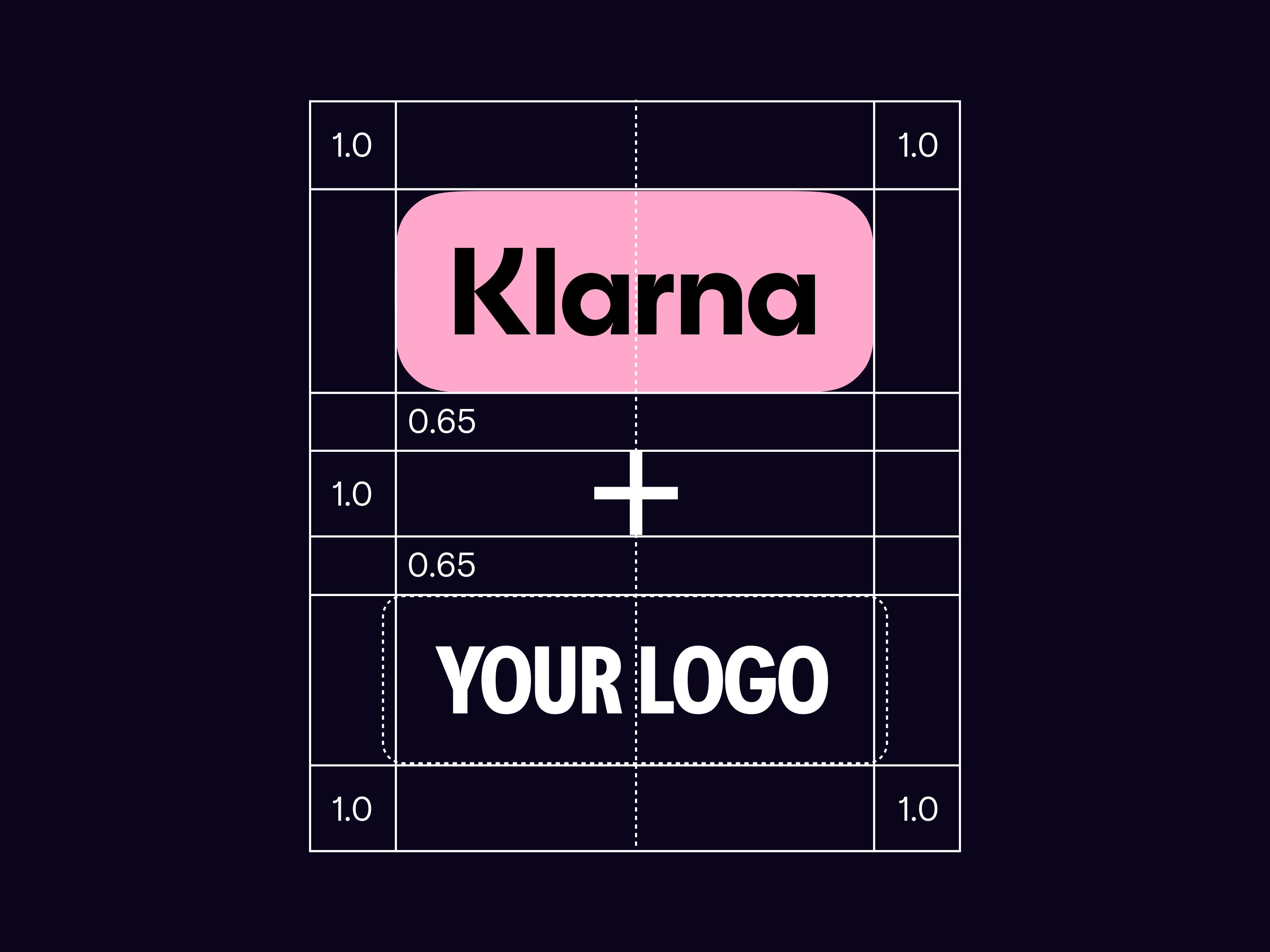
Lockups: Spacing and balance
The lockup needs to be balanced to show both of our logos equally. We recommend that you place your logo between these guidance lines and then balance it visually.
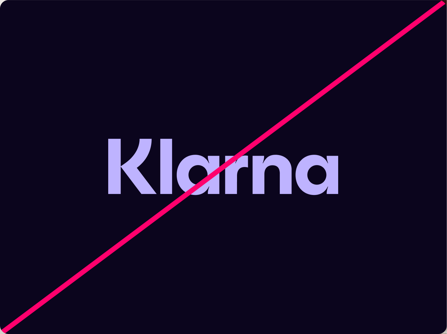
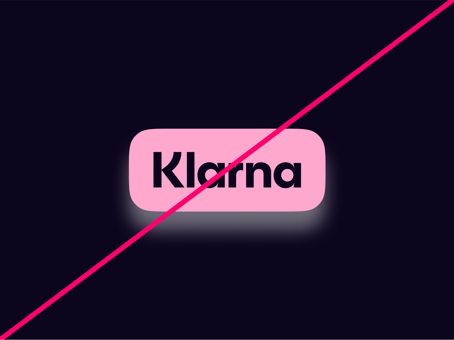
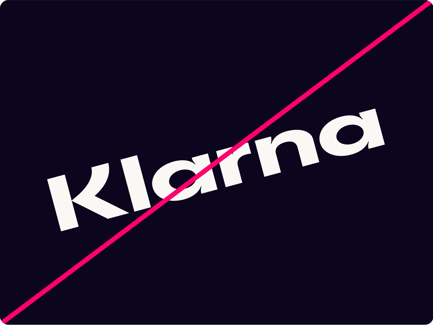
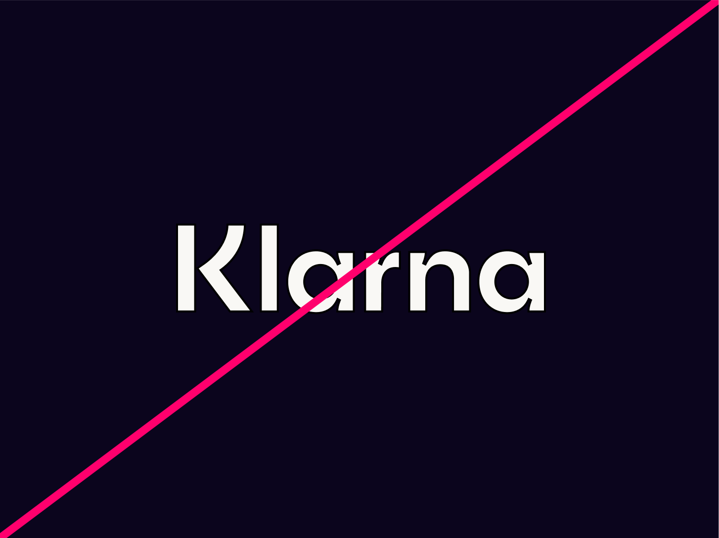
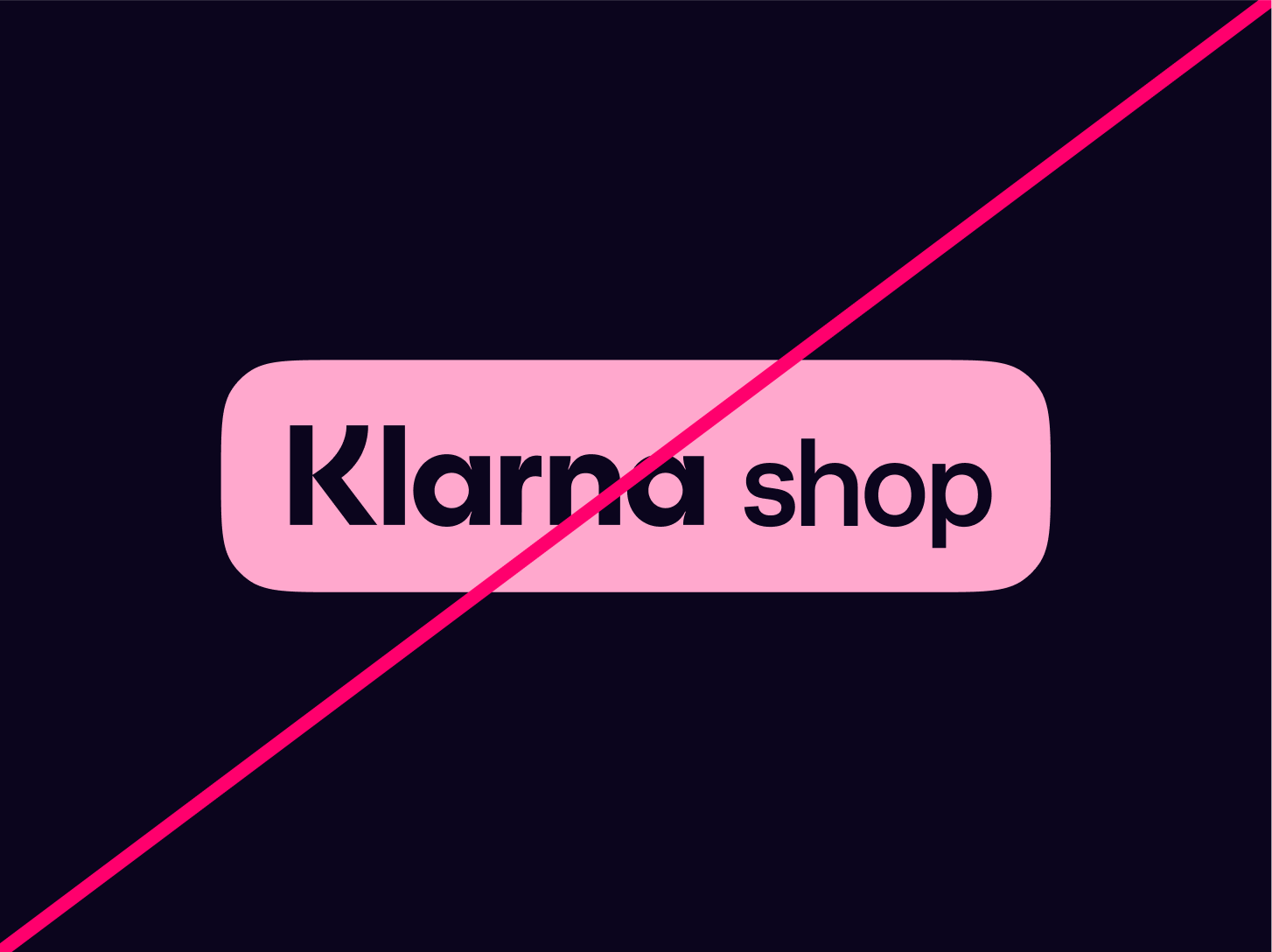
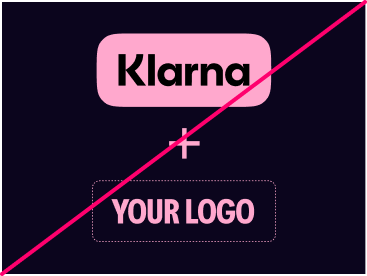
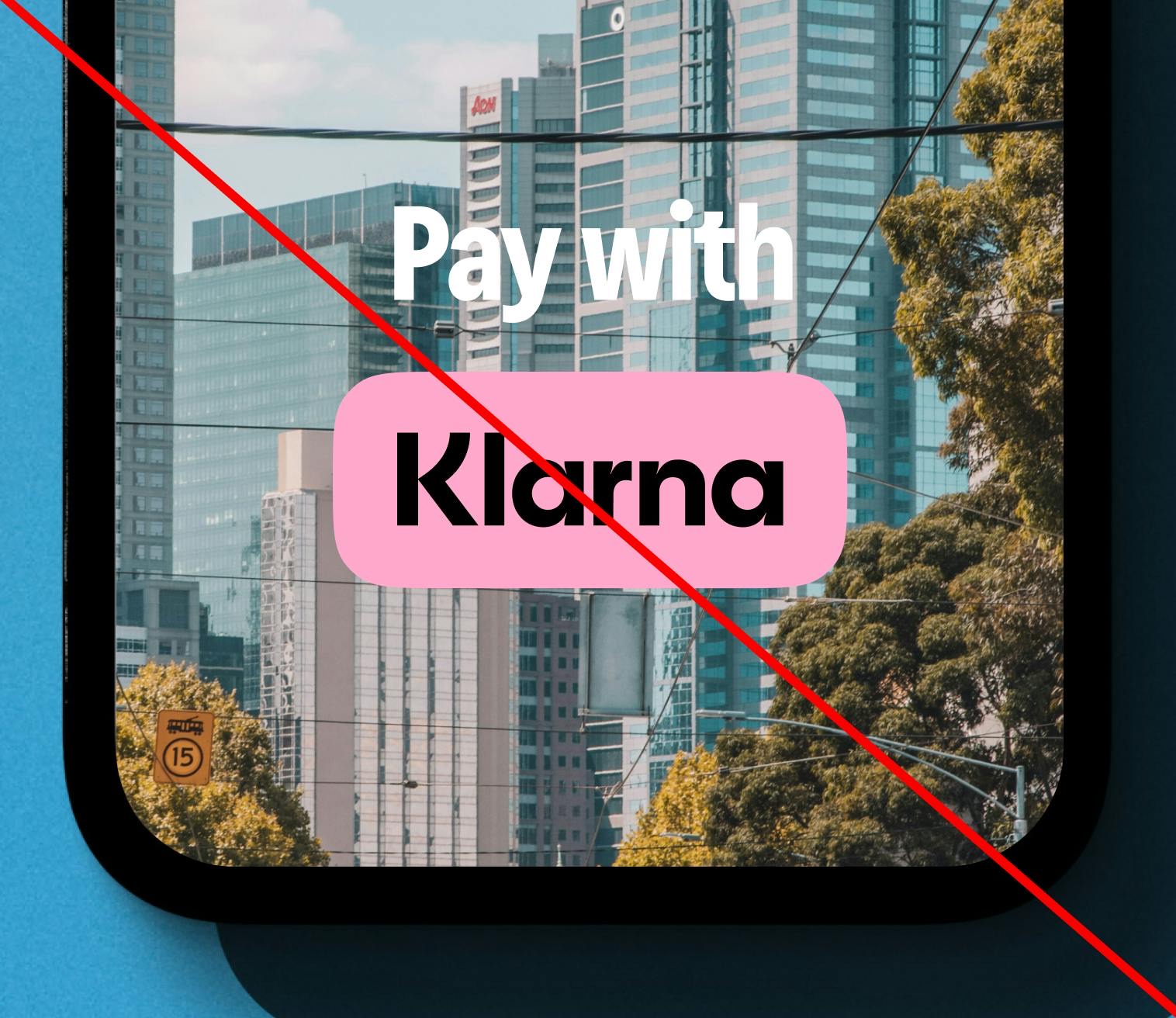
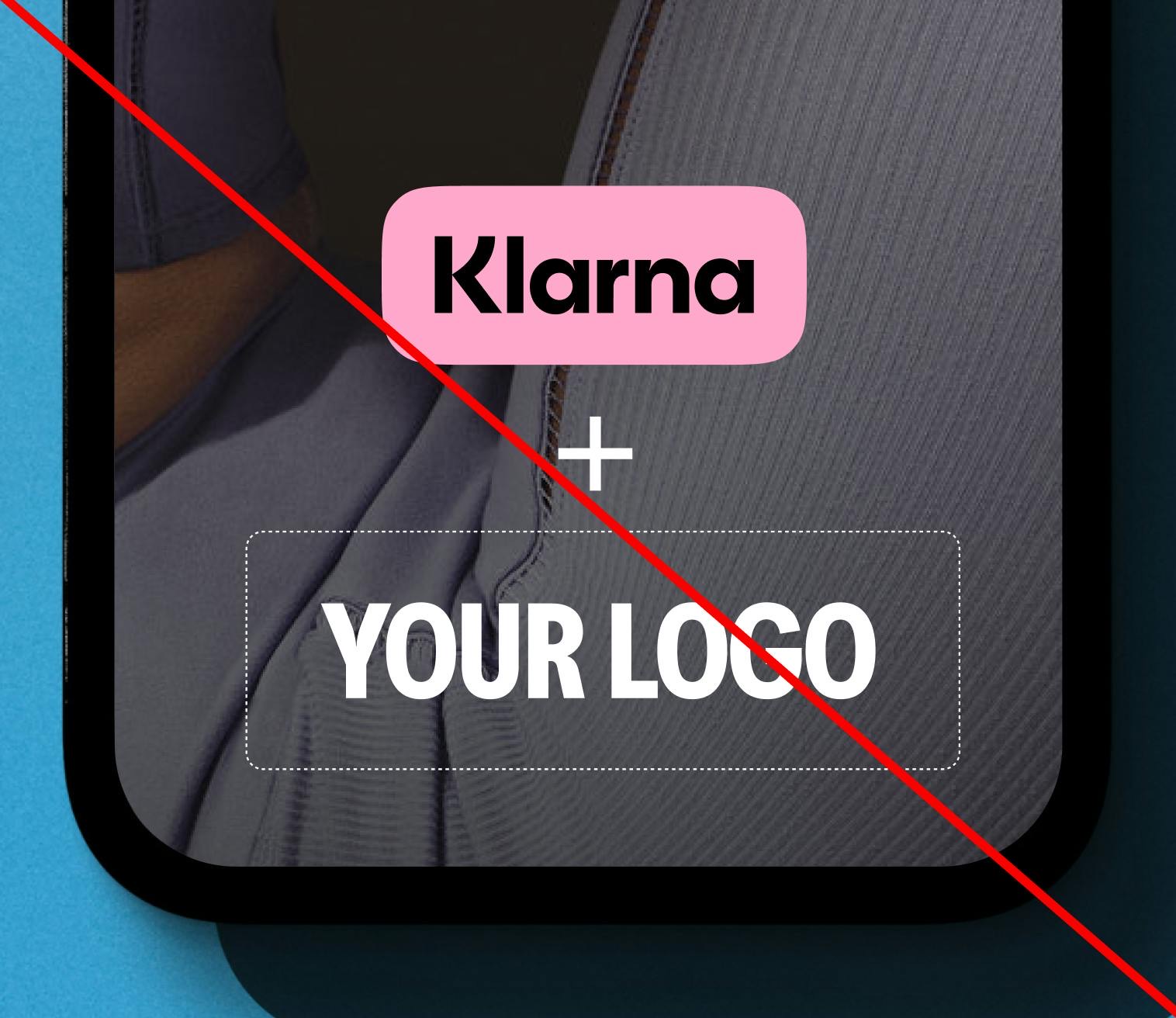
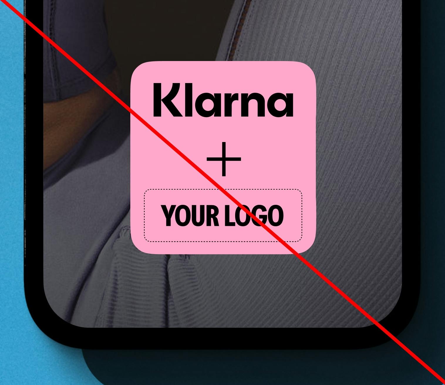
Logos: Misuse
We like our logos as they are. Please do not alter them in any way.