

Button Styling for Sign in with Klarna
This section explains how to adjust the Sign in with Klarna button to match your store’s look and feel while adhering to our brand requirements.
The way you change the button's appearance depends on which method you've used to add the button to your platform:
- System-provided button: Using the system-provided button is the simplest and most straightforward approach. This button comes pre-designed with Klarna's branding, ensuring immediate recognition and trust from users familiar with the Klarna payment experience. This section provides guidelines on how to effectively implement this button, focusing on placement, size, design consistency, and accessibility. By adhering to these recommendations, you can leverage the trusted Klarna brand to enhance your user’s experience, streamline the sign-in process, and potentially increase conversion rates.
- Custom button: For those looking to maintain a cohesive brand experience across your platform while integrating Sign in with Klarna, creating a custom button offers flexibility and control. This option allows for adoption of Klarna's sign-in functionality to fit the unique style and layout of your site.
System-provided button
Theme
The theme defines the button’s color. You can change the theme by setting the value of the theme attribute of the Identity.button() function.
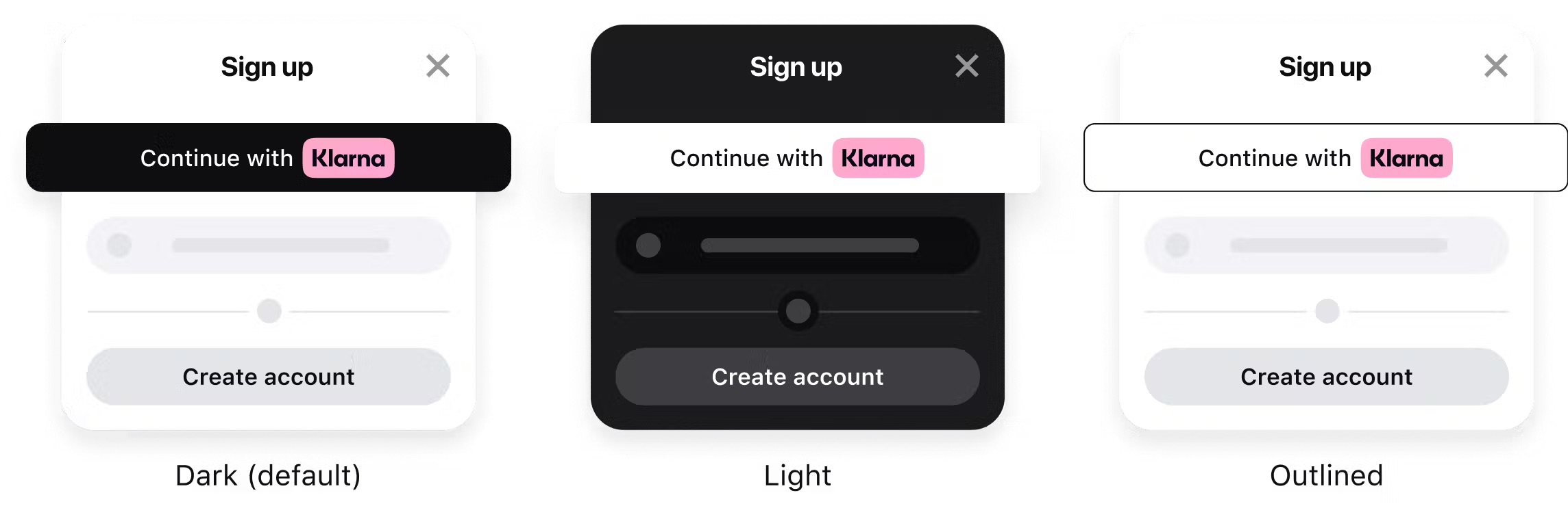
Apart from the default dark theme, you can apply the light theme to have the button displayed in white, or the outlined theme to render the white button with an outline.

Apply styling to display the standard Sign in with Klarna button in different colors.
Default theme (dark)
The button’s default theme color is dark. As the theme attribute is optional, the default theme is applied both when you set the attribute to default or if you omit it from the source code altogether.
We recommend using the default theme as it’s widely recognized by Klarna customers and looks good on light backgrounds.

Sign in with Klarna button in the default dark theme.
const siwkButton = klarna.Identity.button({
  scope: "openid offline_access payment:request:create profile:name",
  redirectUri: "http://localhost:3000/callback.html",
  theme: "default",
})
Sample code to render the default Sign in with Klarna button.
Light theme
Use the light theme to make the button visible on dark backgrounds. To apply the light theme, set the theme attribute to light.

Sign in with Klarna button in the light theme.
const siwkButton = klarna.Identity.button({
  scope: "openid offline_access payment:request:create profile:name",
  redirectUri: "http://localhost:3000/callback.html",
  theme: "light",
})
Sample code to render a white Sign in with Klarna button.
Outlined theme
Use the outlined theme to make the button visible on all backgrounds. To apply the this theme, set the theme attribute to outlined.

Sign in with Klarna button in the outlined theme.
const siwkButton = klarna.Identity.button({
  scope: "openid offline_access payment:request:create profile:name",
  redirectUri: "http://localhost:3000/callback.html",
  theme: "outlined",
})
Sample code to render a white, outlined Sign in with Klarna button.
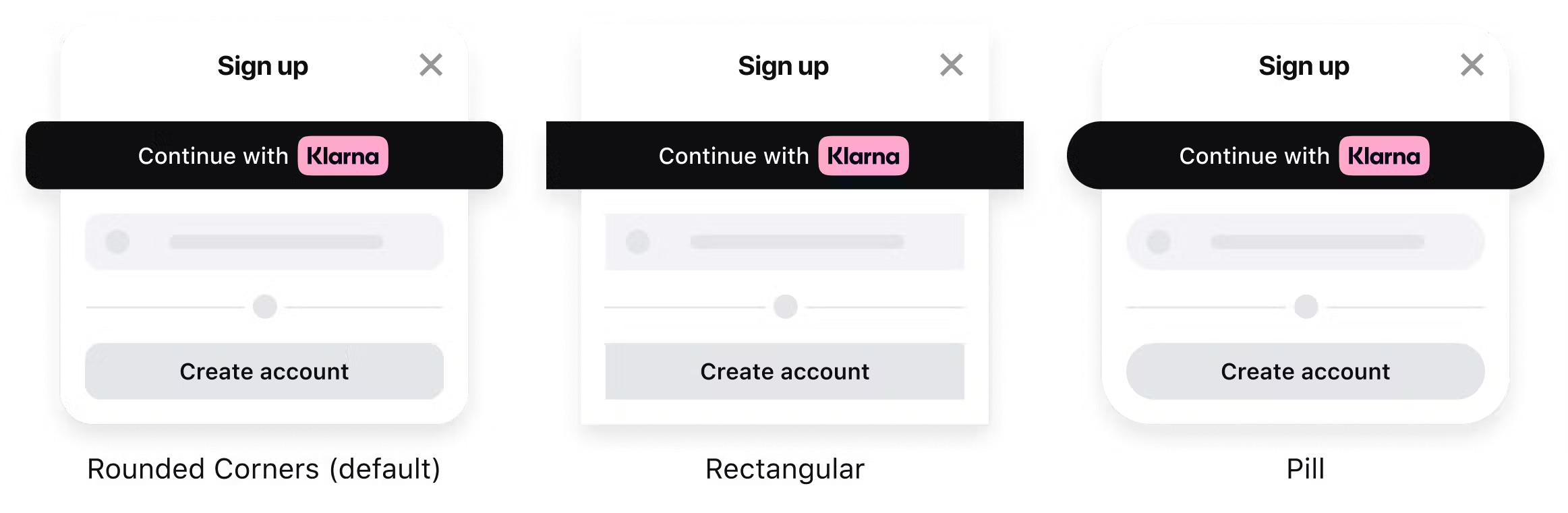
Button shape
There are three shapes available with the Sign in with Klarna button: default, rectangle, or pill. To control the button's shape, change the value of the shape attribute. Customize the shape of the button to best suit your platform’s look and feel.
Apply styling to display the standard Sign in with Klarna button in different shapes.
Default shape
The default Sign in with Klarna button shape is a rectangle with rounded corners. To apply the default shape, set the shape attribute of the Identity.button() function to default.
Sign in with Klarna button in the default shape with rounded corners.
const siwkButton = klarna.Identity.button({
  scope: "openid offline_access payment:request:create profile:name",
  redirectUri: "http://localhost:3000/callback.html",
  shape: "default",
})
Sample code to render Sign in with Klarna button in the default shape.
Rectangle shape
To apply the rectangular shape with square corners, set the shape attribute of the Identity.button() function to rect.

Sign in with Klarna button in the rectangular shape.
const siwkButton = klarna.Identity.button({
  scope: "openid offline_access payment:request:create profile:name",
  redirectUri: "http://localhost:3000/callback.html",
  shape: "rect",
})
Sample code to render Sign in with Klarna button in the rectangular shape.
Pill shape
To apply the pill shape, set the shape attribute of the Identity.button() function to pill.

Sign in with Klarna button in the pill shape.
const siwkButton = klarna.Identity.button({
  scope: "openid offline_access payment:request:create profile:name",
  redirectUri: "http://localhost:3000/callback.html",
  shape: "pill",
})
Sample code to render Sign in with Klarna button in the pill shape.
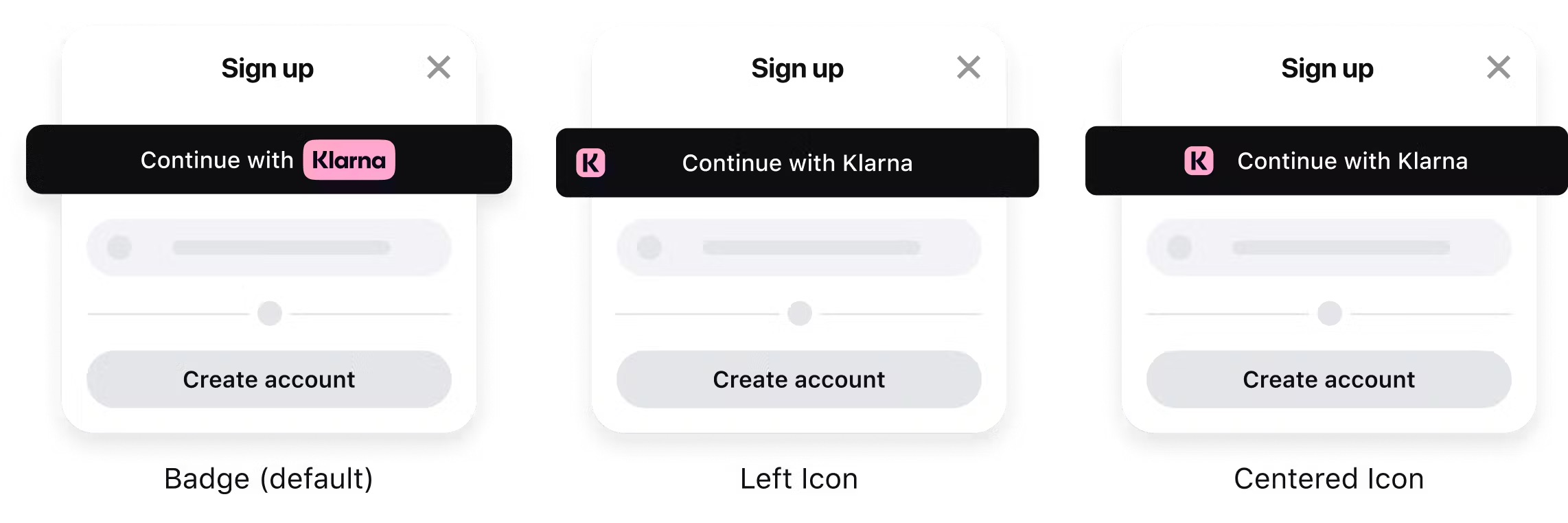
Badge alignment
There are three ways you can choose to show the Klarna trademark on the button: badge, left icon or centered icon. To control the button's alignment, change the value of the logoAlignment attribute.
Apply styling to choose how the Klarna badge or icon is displayed on the Sign in with Klarna button.
Default alignment
The default Sign in with Klarna button alignment is the Klarna badge centered with text before. To apply the default shape, set the logAlignment attribute of the Identity.button() function to default.
Sign in with Klarna button with the default Klarna logo placement.
const siwkButton = klarna.Identity.button({
  scope: "openid offline_access payment:request:create profile:name",
  redirectUri: "http://localhost:3000/callback.html",
  logoAlignment: "default",
})
Sample code to render Sign in with Klarna button with the default badge alignment.
Left icon alignment
If you prefer to use the Klarna icon aligned to the left of the button, set the logoAlignment attribute of the Identity.button() function to left.

const siwkButton = klarna.Identity.button({
  scope: "openid offline_access payment:request:create profile:name",
  redirectUri: "http://localhost:3000/callback.html",
  logoAlignment: "left",
})
Sample code to render Sign in with Klarna button with the Klarna icon aligned to the left.
Centered icon alignment
If you prefer to position the Klarna icon to the center with the text trailing, set the logoAlignment attribute of the Identity.button() function to center.

const siwkButton = klarna.Identity.button({
  scope: "openid offline_access payment:request:create profile:name",
  redirectUri: "http://localhost:3000/callback.html",
  logoAlignment: "center",
})
Sample code to render Sign in with Klarna button with the icon aligned to the center.
Resizing Button
The "Sign in with Klarna" button provided by our Web SDK is designed to be flexible and adapt to various layouts. Below, we outline the default dimensions and the recommended minimum and maximum sizes for the button.
Default Dimensions
- Width: 335px
- Height: 48px
Minimum and Maximum Dimensions
- Minimum Width: 48px
- Minimum Height: 35px
- Maximum Height: 60px
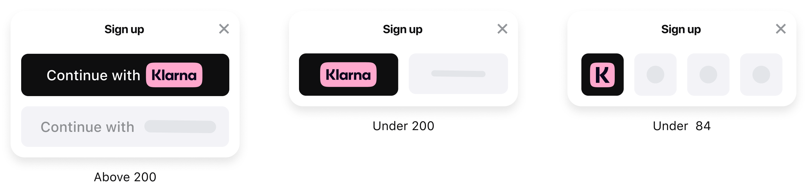
Responsive Variants Based on Width
The SIWK button's content dynamically changes based on its width. Here are the breakpoints and the respective button appearances:
Width > 200px
- Displays the full text: "Continue with Klarna" (text "Continue with" + Klarna logo).
84px ≤ Width ≤ 200px
- Displays the "Klarna" logo only.
Width < 84px
- Displays a compact version of the "Klarna" logo, featuring only the letter "K."
Styling Instructions
- To adjust the button size, modify the width and height properties using CSS.
- Ensure the button size remains within the defined constraints for optimal performance and usability.
#klarna-identity-button {
  width: 150px; /* Adjust as needed */
  height: 48px; /* Keep between 35px and 60px */
}
Creating a custom button
Colors
Centered around the iconic Klarna pink, our primary palette runs the show in our visual world. Friendly Klarna off white and bold Klarna black help create a balanced, approachable look. More details here.
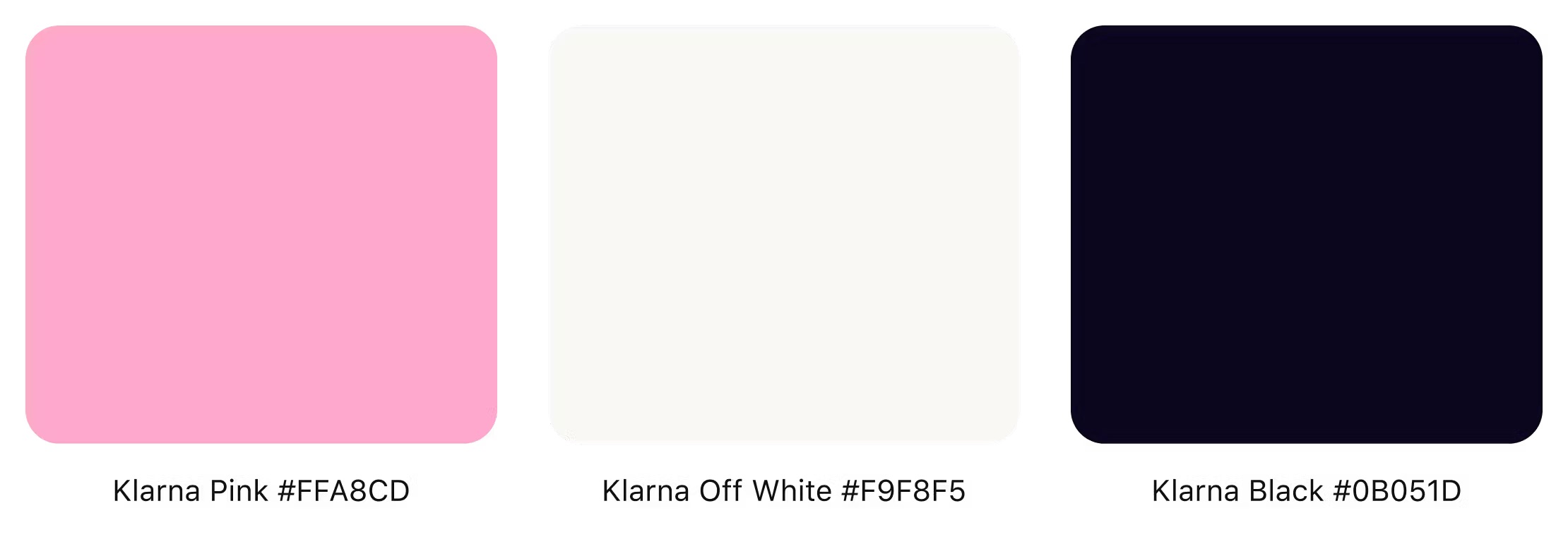
The three colors that are key to Klarna's branding: Klarna pink (#FFA8CD), Klarna off white (#F9F8F5), and Klarna black (#0B051D).
Background
We strongly advise to only use Klarna Black (hex value #0B051D), white (hex value #FFFFFF) or Klarna off white (hex value #F9F8F5) for the button's background color.
Don't use Klarna Pink and colors from your own brand as the background color.
Use Klarna black, white, or Klarna off white as the button's background color.
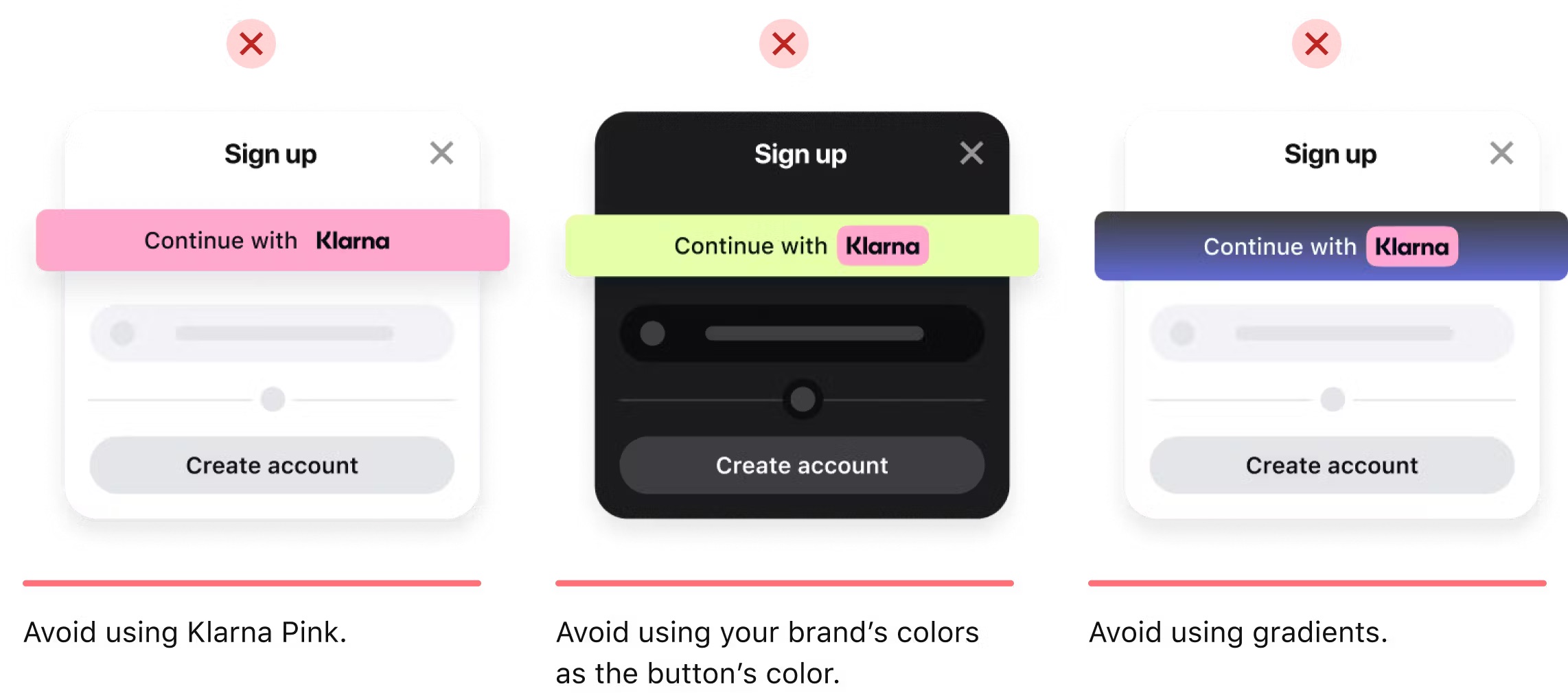
Avoid using Klarna pink, your own brand colors, and gradients as background colors.
Trademark
Including Klarna’s trademark is essential to the success of the button as it creates instant recognizability.
You can read more about the Klarna trademark and Klarna icon on the Klarna brand guidelines website.
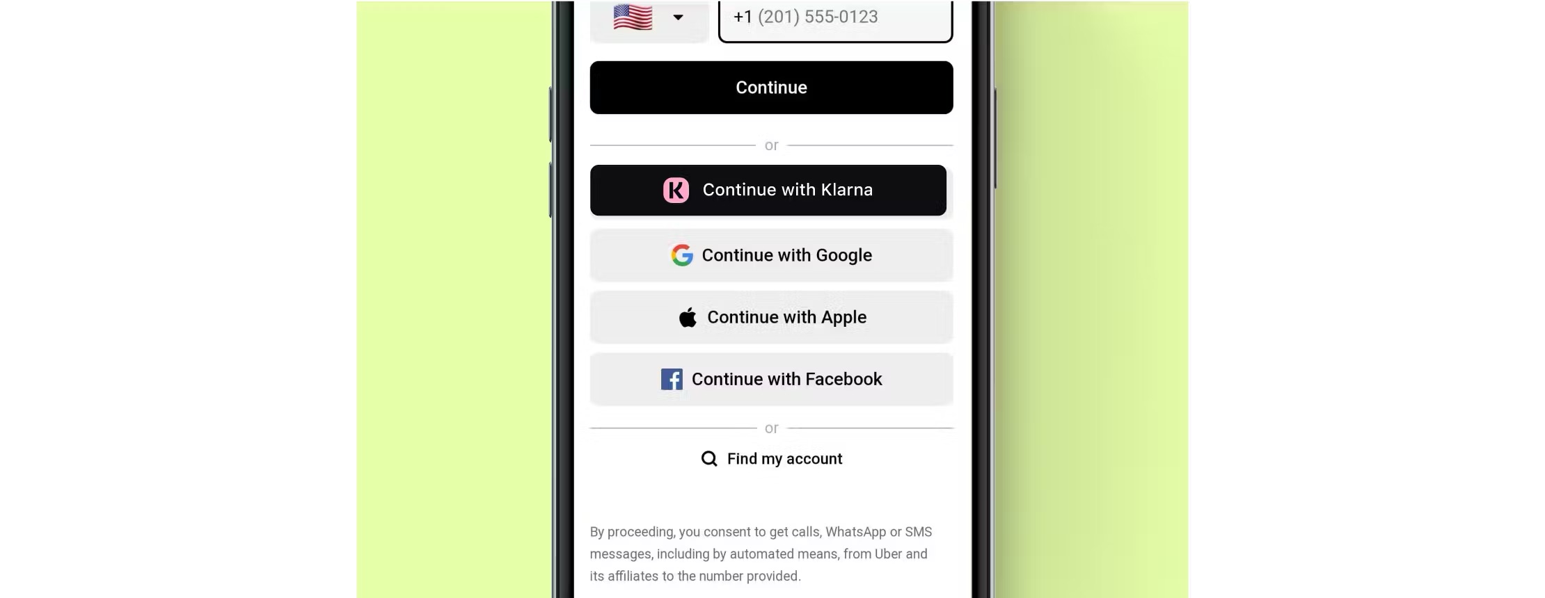
Badge
We suggest using the Klarna badge whenever possible.
If you're using the Klarna badge in your custom button, make sure to leave clear space that corresponds to at least the height of our wordmark.

The minimum clear space for the badge is defined by the height of our wordmark.
Download the Klarna badge from our Brand Guidelines in your preferred format and color by clicking one of the thumbnails in the gallery below:
Icon
Limited space? Need the button to align with other sign in methods? Use the Klarna icon.
Find Klarna icon in your preferred format and color in Klarna Brand site