Ready to make the most of On-site messaging? Here's what you need to know before integrating this solution into your store's website or mobile app.
On-site messaging is a solution that enables you to add tailored messaging to your business website or mobile app. With On-site messaging, you can let your customers know about the available payment options as they browse your online store, even before they decide to buy.
When you integrate Klarna into your business, your customers can find our flexible payment methods at your checkout. And On-site messaging is a great way to inform your customers beforehand about these paying benefits. For example, they can learn from the messages that they can pay with Klarna and that flexible payment options are available for their purchase.
Throughout their purchase journey, your customers see anticipated and interactive information about:
- Klarna and the flexibility we provide
- payment options for a specific purchase amount
- Klarna basics like what it is and how it works
On-site messaging could be integrated directly via our SDK or API, or in a faster manner using our platforms plugins. Explore all available integrations options here
- Free of charge: You can add On-site messaging for free. It's the perfect complement for any Klarna checkout or payment solution you've integrated into your purchase flow.
- Compliant messages: On-site messaging is an advertisement platform regulated by local authorities for each market. All the products and messaging we promote are legally compliant and always up-to-date.
- Clean of cookies: Different from other similar solutions, On-site messaging doesn't place cookies by default.
- Look and feel: We offer a variety of assets for showing messages across relevant pages of your online store. Every asset is dynamic and adjustable to the payment methods you offer. You can change the design, so the asset fits seamlessly into your site or app. You can also customize the font, color of text and links, padding, and much more.
On-site messaging is a great way to motivate your customers in their shopping by informing them about the flexible payment options they can use.
Your customers can see this information through messages displayed during the purchase journey, and you can decide where the messages appear and how they look.
To have On-site messaging up and running in your online store, you need to:
1. Choose the placement type: Define which of our messaging assets you want to use and where they'll appear.
2. Integrate: Follow the steps to activate, install, and customize the messages. You can also perform a test in the playground environment (optional) and then complete the integration in the production environment.
3. Go live: Replace the code in production with the snippet you tested in playground.
When choosing the messages to integrate into your online store, you also select where your customers will see them throughout their purchase journey. Placements are message containers, which you have to define in the source code of your online store.
For your cart and product pages, we offer dynamic messages. These are tailored messages for specific purchase cases. Their content changes according to different conditions, such as purchase amount and the payment methods you offer.
From a pool of possible messages to display, our targeting algorithm selects the most adequate message for each case. The algorithm selects the messages taking different aspects into consideration (for example, the offered payment methods, the accepted payment range for each payment method, and more).
Product and cart pages
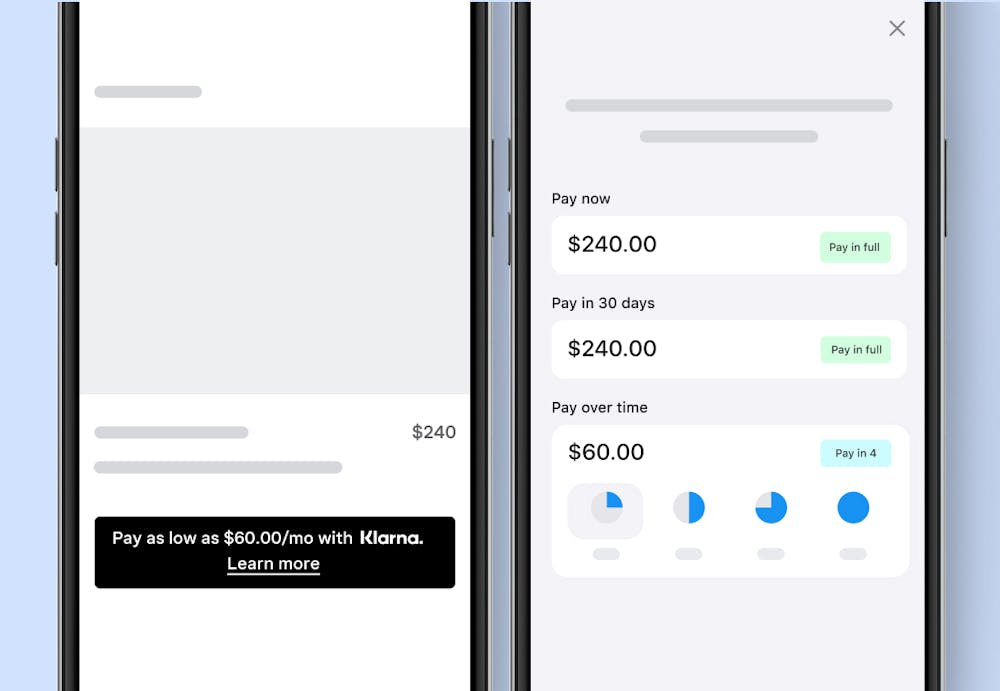
Delivering the right payment message in crucial moments of the purchase can increase both conversion and average order values. Use On-site messaging to show payment options on the product page and cart page of your online store. The messages are tailored based on the item price or basket size.

Sample of product page messaging.
For the product and cart pages messaging, we use our credit promotion placement. It displays interactive Klarna messaging in two different shapes: displaying the Klarna logo or showing an in-line Klarna mention in the message.
By clicking on the message, your customers learn more about the payment methods with calculated prices and can also interact with the payment amount to estimate their budget.
Inform your customers about their financing options as early as possible. Add these assets to all of your pages, catch your customers' attention, and let them know they can pay with Klarna.
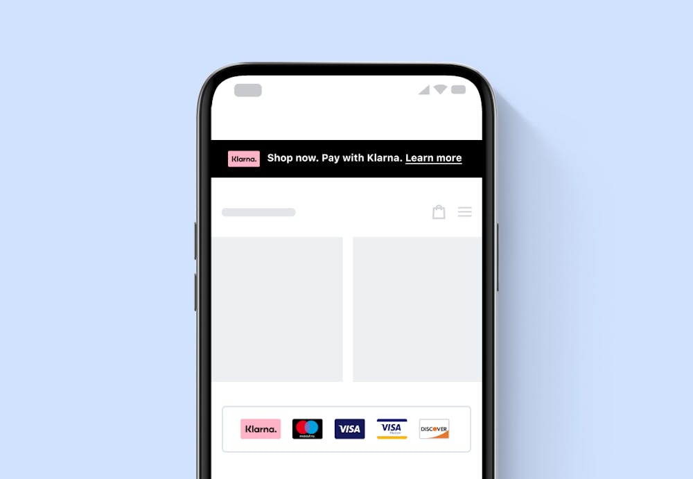
The placements for these messaging assets are footer and top-strip:
Top-strip
This is an interactive Klarna messaging that stays static at the top of the pages of your online store. Similar to credit promotion, when clicking on this message, your customers get information on all the available payment methods. For top-strip promotion, you can choose between two different shapes: displaying the Klarna logo or showing an in-line Klarna mention in the message.
Footer
This is a non-interactive Klarna messaging that stays at the bottom of every page of your online store. Showcase the Klarna badge and all other payment providers you offer at your checkout.

Sample of footer and top-strip messaging.
Frequently asked questions (FAQs)
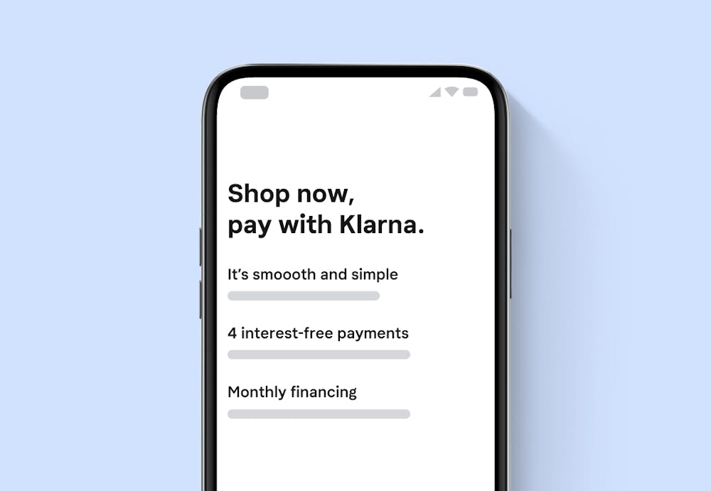
Tell your customers everything they want to know about buying with Klarna by adding our dynamic one-pager FAQ landing page. This way, you’ll reduce contacts to your customer service as well as any friction in the purchase journey.

Sample of FAQ messaging.
The link to our FAQ page can be easily placed into your navigation bar or footer and the page dynamically shows information adjusted to the Klarna payment methods you offer.
There are multiple approaches to integrate On-site messaging, before anything, make sure you complete the steps in this section.
Ensure you start by customizing and trying out your messaging assets in the test Merchant portal (playground environment), and then you reproduce the configuration in the Merchant portal (production environment).
Depending on how you are integrating, some of the following tools and technical considerations might help you to make the best out of On-site messaging:
- Merchant portal (production environment)
The workplace to manage all the Klarna products integrated with your business. The portal lets you control and operate On-site messaging. - Merchant portal playground (test environment)
Design and try out the assets in the Merchant portal's playground environment before going live. - Merchant portal credentials
For both playground and production environments, you require an account to access and start using the Merchant portal. Make sure to select the right environment you want to access. - Demo store
See what your customers experience when they shop with Klarna. Here you can visualize how the different messaging assets look. - Placements
Before getting down to work, you also need to know where you'd like the messaging to appear on your online store. - Browsers
We aim to provide support for the last three major versions of the popular browsers (Chrome, Firefox, Edge, and Safari) that covers at least 99.5% of the market share. - Source code
You need access and editing privileges to the source code of your online store. - Merchant ID
You can get this identification number in the Merchant portal or you can request it from your account manager.
Explore all available plugins here