
Express button solution has been deprecated.Express button solution has been deprecated. If you're interested in the a Express Checkout experience for Klarna payments, you can learn about our new solution Klarna Express CheckoutKlarna Express Checkout
To integrate Klarna Express Button as a native view in your Android application, you need to create an instance of the view, add it to your view hierarchy, and receive the user details once the Klarna Express Button flow is completed:
- Create an instance of the button.
- Add the button to your screen.
- Receive the user details by implementing the event handler.
The Klarna Express Button native view in Android is called KlarnaExpressButton. You can create an instance programmatically or inflate it from an XML file. Additionally, you can also set parameters from the XML.
Create the Button Programmatically
You can create the native view programmatically and place it in your application with desired layout options.
//Create an instance of KlarnaExpressButton
val button = KlarnaExpressButton(...)

// Add it to your container with desired layout parameters
val layoutParams = ViewGroup.LayoutParams(ViewGroup.LayoutParams.WRAP_CONTENT,
ViewGroup.LayoutParams.WRAP_CONTENT)
containerViewGroup.addView(button, 0, layoutParams)
Create the Button from XML
Optionally you can also create the native view in your XML and get the view instance programmatically either by findViewById or by the generated DataBinding instance of your layout.
<com.klarna.mobile.sdk.api.expressbutton.KlarnaExpressButton
      android:id="@+id/klarnaExpressButton"
      android:layout_width="wrap_content"
      android:layout_height="wrap_content"
      …
/>
Parameters used for the Klarna Express Button are set as variables of the button instance or as attributes in the XML declaration.
| Parameter | Type | Description |
|---|---|---|
| context | Context | The context of the Activity the Klarna Express Button is in. |
| clientId | String | The environment-specific merchant identifier (MID). |
| locale | String? (Optional, defaults to “en-US”) | Localization, a list of supported locales can be found in this [ table]. |
| eventHandler | KlarnaEventHandler? (Optional) | The interface to receive results from Klarna. |
| returnURL | String? (Optional) | URL schema as defined in your AndroidManifest.xml to return from external applications. |
| buttonTheme | KlarnaButtonTheme? (Optional, defaults to “KLARNA”) | Enumerated value to specify how to stylize the button on light and dark configurations. |
| buttonShape | KlarnaButtonShape? (Optional, defaults to “ROUNDED_RECT”) | Enumerated value to specify how the button’s shape should be. |
| buttonLabel | KlarnaButtonLabel? (Optional, defaults to “KLARNA_PRODUCT”) | Enumerated value to specify the label text should be on the button. |
| environment | KlarnaEnvironment? (Optional, defaults to “PRODUCTION”) | Enumerated value to set the working environment for the button. |
| region | KlarnaRegion? (Optional, defaults to “NA”) | Enumerated value to set the geographical region of the user/application. |
| theme | KlarnaTheme? (Optional, defaults to “LIGHT”) | Enumerated value to specify how the content in the Klarna Express Button flow should be stylized on light and dark configurations. (Note: buttonTheme parameter would set the theme for the button only) |
While the user is interacting with the Klarna Express Button or when the flow is completed, you can receive events accordingly by setting an event handler when creating an instance of the button.
val eventHandler = object : KlarnaEventHandler {
   override fun onEvent(klarnaComponent: KlarnaComponent, event: KlarnaProductEvent) {
      when(event.action) {
         KlarnaExpressButtonEvent.USER_TAPPED_BUTTON -> {
            // User tapped the Klarna Express Button
         }
         KlarnaExpressButtonEvent.USER_AUTHENTICATED -> {
            // User is authenticated. You can read the user details
            // in event.params attribute.
</div>
Klarna Express Button events are as follows:
| Name | Description |
|---|---|
| KlarnaExpressButtonEvent.USER_TAPPED_BUTTON | The user tapped on the Klarna Express Button. |
| KlarnaExpressButtonEvent.USER_AUTHENTICATED | Klarna Express Button flow is completed successfully and the user is authenticated. You can read user details from the event. |
| KlarnaExpressButtonEvent.USER_AUTHENTICATED_DATA_TOKEN | Klarna Express Button flow is completed successfully and the user is authenticated. You can read user’s data token from the event. |
Predefined Klarna Express Button error names are as follows:
| Name | Description |
|---|---|
| KlarnaExpressButtonError.KlarnaExpressButtonErrorInvalidParams | The parameters set for Klarna Express Button are invalid |
| KlarnaExpressButtonError.KlarnaExpressButtonErrorRender | Rendering the Klarna Express Button has failed |
Example of user details received with USER_AUTHENTICATED event (event.params value):
{
  first_name: "John",
  last_name: "Doe",
  email: "example@example.com",
  date_of_birth: "1990-01-01",
  phone: "+18004444444",
  address: {
    street_address: "3100 Pear Road",
    street_address2: null,
postal_code: "93309",Example of user’s data token received with USER_AUTHENTICATED_DATA_TOKEN event (event.params value):
{
   express_button_data_token: "1886db92-tj82-1277-n6h2-1197be8701c6"
}
Klarna offers several theme, label, and shape options to customize the Klarna Express Button's appearance to match the look and feel of your application.
KlarnaButtonTheme
KlarnaButtonTheme enumeration will be used to define which style to be used, depending on either the app’s configuration or the system setting.
| Name | Description | Express Button |
|---|---|---|
| KLARNA | Renders the button in the Klarna pink theme. This is the recommended theme as it has the highest brand recognition and the likelihood of usage by your customers. | 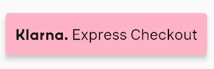 |
| LIGHT | Renders the button in white. It is recommended to use this theme on dark backgrounds. | 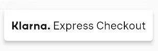 |
| DARK | Renders the button in black. It is recommended to use this theme on light backgrounds. | 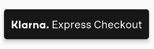 |
| AUTO | Automatic theme (light or dark) that will use the system’s user interface style. |
KlarnaButtonShape
In order for the Klarna Express Button to fit into the aesthetic of your application, we offer different button shapes.
| Name | Description | Express Button |
|---|---|---|
| ROUNDED_RECT | Renders the button as a rectangle with rounded corners. | .jpg) |
| PILL | Renders the button as a pill-shaped button. | 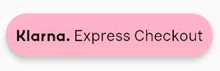 |
| RECTANGLE | Renders the button as a rectangle with square corners. | 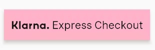 |
KlarnaButtonLabel
KlarnaButtonLabel enumeration will be used to select which label you wish to be shown on the button.
| Name | Description | Express Button |
|---|---|---|
| KLARNA_PRODUCT | Renders the button with this product’s specific label which is “Klarna. Express Checkout”. | |
| KLARNA | Renders the button only with Klarna logo. |  |