
Change the button’s appearance to match your store’s look and feel.
Express button solution has been deprecated.Express button solution has been deprecated. If you're interested in the a Express Checkout experience for Klarna payments, you can learn about our new solution Klarna Express CheckoutKlarna Express Checkout
Apply custom styling to display Express button in different colors, shapes, and sizes.
You can change the button’s color, label, shape, and size in a way that best suits your store’s design. To modify the style of the button, edit the source code as explained in this guide.
The theme defines the button’s color. You can change the theme by setting the value of the data-theme attribute of the klarna-express-button element.
Apart from the default pink theme, you can apply the dark theme to have the button displayed in black, or the white theme to render the white button.
The button’s default color theme is pink. As the data-theme attribute is optional, the default theme is applied both when you set the attribute to default or if you omit it from the source code altogether.
We recommend using the default theme as it’s widely recognized by Klarna customers.

Express button in the default pink theme.
<klarna-express-button data-locale='en-US' data-theme='default' />
Sample code to render a pink Express button.
Use the dark theme to make the button visible on light backgrounds. To apply the dark theme, set the data-theme attribute to dark.

Express button in the dark theme.
<klarna-express-button data-locale='en-US' data-theme='dark' />
<p>
Sample code to render a black Express button.
Use the light theme to make the button visible on dark backgrounds. To apply the light theme, set the data-theme attribute to light.

Express button in the light theme.
<klarna-express-button data-locale='en-US' data-theme='light' />
<p>
Sample code to render a white Express button.
Pick a version of the text you want to display on the button in your checkout. You can control the text by changing the value of the data-label attribute of the klarna-express-button element.
When you set the data-label attribute to default, the label will contain the Klarna logo and an Express checkout indicator.
Express button with the default label.
<klarna-express-button data-locale='en-US' data-theme='default' data-shape='default' data-label='default'/>
Sample code to render Express button with a default label.
When you set the data-label attribute to klarna, the button will only show the Klarna brand name, without any accompanying text.
Express button with the Klarna label.
<klarna-express-button data-locale='en-US' data-theme='default' data-shape='default' data-label='klarna'/>
<p>
Sample code to render Express button with a default label.
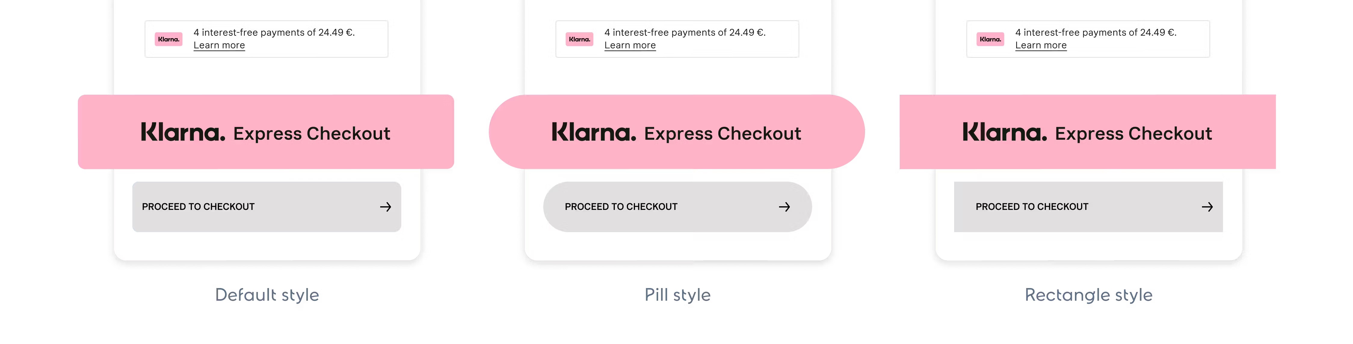
You can choose from 3 different shapes for the button: default, rectangle, or pill. To control the button's shape, change the value of the data-shape attribute.
The default Express button shape is a rectangle with rounded corners. To apply the default shape, set the data-shape attribute of the klarna-express-button element to default.
Express button in the default shape.
<klarna-express-button data-locale='en-US' data-theme='default' data-shape='default'/>
Sample code to render Express button in the default shape.
To apply the rectangular shape with square corners, set the data-shape attribute of the klarna-express-button element to rect.

Express button in the rectangle shape.
<klarna-express-button data-locale='en-US' data-theme='default' data-shape='rect'/>
Sampole code to render Express button in the rectangle shape.
To apply the pill shape, set the data-shape attribute of the klarna-express-button element to pill.

Express button in the pill shape.
<klarna-express-button data-locale='en-US' data-theme='default' data-shape='pill'/>
Sample code to render Express button in the pill shape.
Change the size of the button by editing the CSS styles.
Express button comes in a default size that you can change as long as you keep it within supported ranges.
| Dimension | Default | Minimum | Maximum |
|---|---|---|---|
| Width | 308px | 145px | 500px |
| Height | 50px | 35px | 60px |
To give the button specific dimensions, add a class to the klarna-express-button element in the website’s HTML and specify the class’ width and height in CSS.
klarna-express-button.custom-button {
  width: 236px; // min: 145px, max: 500px
  height: 47px; // min: 35px, max: 60px
}
Change the button size by applying a class and targeting it in CSS.
Express button supports responsive web design. Like other elements on your page, you can use media queries to resize the button depending on the viewport size.
The below example shows how you can use a media query to specify a custom size for screens up to 500px wide and use a custom class to set a height and width for other viewports.
// define this class in your default case (screen width > 500px)
klarna-express-button.custom-button {
  height: 35px;
  width: 190px;
}

@media (max-width: 500px) {
  // define this class for the case screen width <= 500px
  klarna-express-button.custom-button {
height: 35px;Use media queries to resize Express button based on the viewport size.
If you’re adding multiple buttons on a page and want to size them differently, create a separate class for each button in HTML, then specify the size for each class in CSS.
<klarna-express-button class="custom-button-1" data-locale="en-US" data-theme="default" />
<klarna-express-button class="custom-button-2" data-locale="en-US" data-theme="default" />
Sample code to assign different classes to each klarna-express-button element to style buttons separately.
klarna-express-button.custom-button-1 {
  height: 35px;
  width: 190px;
}
klarna-express-button.custom-button-2 {
  height: 47px;
  width: 236px;
}
Sample code to define the button size in CSS.