To maximize your store sales, implement Klarna according to these best practices is essential. Implemented Klarna to your checkout with dynamic branding, optimized payment buttons, and interoperability support.
To maximize sales, Klarna is integrated into the checkout in a way that enhances visibility and ensures customers can easily identify Klarna and understand their payment options. A well-structured checkout improves customer confidence, reduces abandonment rates, and drives higher conversions. Partners must dynamically retrieve Klarna’s branding, payment descriptors, and personalized messaging via Klarna’s APIs to present accurate, localized, and up-to-date payment options.
Acquiring Partners are required to dynamically retrieve presentation data to ensure that the correct messaging is always presented, simplifying expansion and supporting global scalability. Klarna’s SDK dynamically returns accurate descriptors based on merchant account settings and transaction specifics, ensuring compliance and optimizing customer conversion rates.
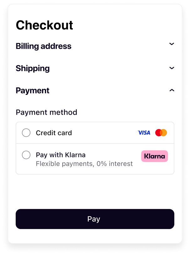 | 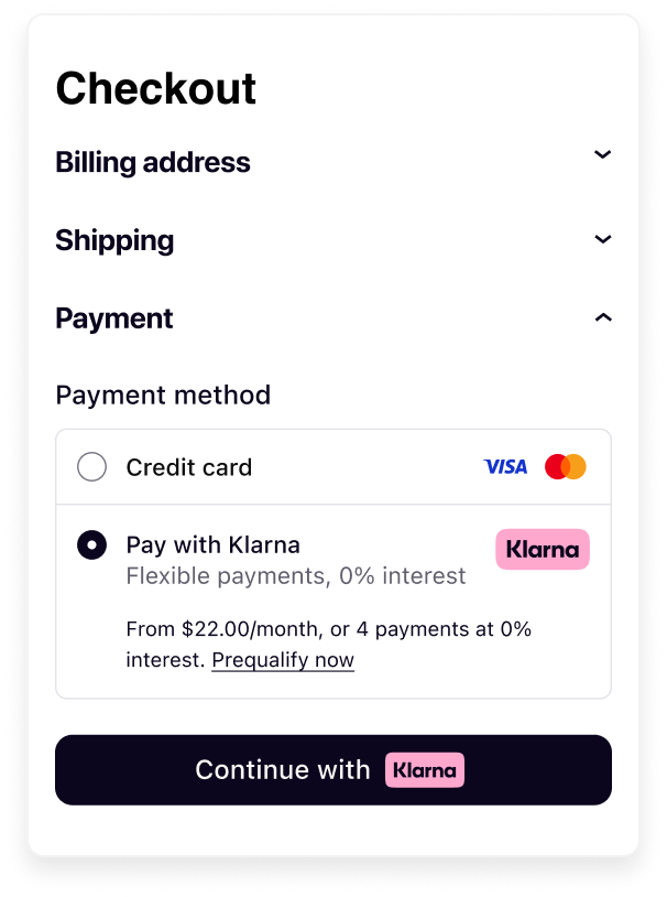 |
| Payment form before selection | Payment form after selection |
Acquiring Partners are expected to:
- Add Klarna as a payment option into their payment forms.
- Present Klarna in the payment form according to these visual guidelines.
- Update the Payment button (“Continue with Klarna”) when customer selects Klarna.
- Optimize checkout behaviour following Product suite interoperability guidelines.
- Respect technical requirements and dynamically retrieve data.
A well-structured Klarna checkout experience improves customer trust, enhances transparency, and increases conversion rates. To achieve this, Acquiring Partners should ensure Klarna is clearly represented, with messaging dynamically retrieved, and seamlessly integrated into the checkout. Here are four core elements to keep in mind:
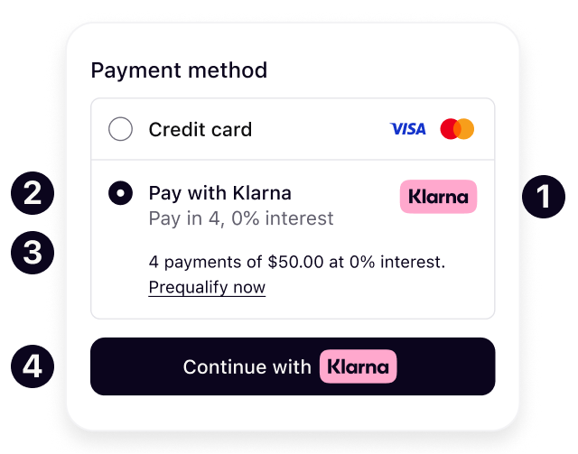
Klarna’s branding must be consistent and instantly recognizable across all checkout touchpoints. The Klarna logo is dynamically retrieved and fetched directly from Klarna to maintain a uniform appearance and reinforce Klarna as a trusted payment method.
Klarna provides variations of its logo that match all industry standards and adjust to the Acquiring Partners format.
The header and sub header introduce Klarna in the payment form. The value will be dynamically adjusted based on the locale of the customer, adjusting language to match the customers market and language provided in the request.
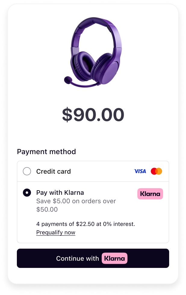
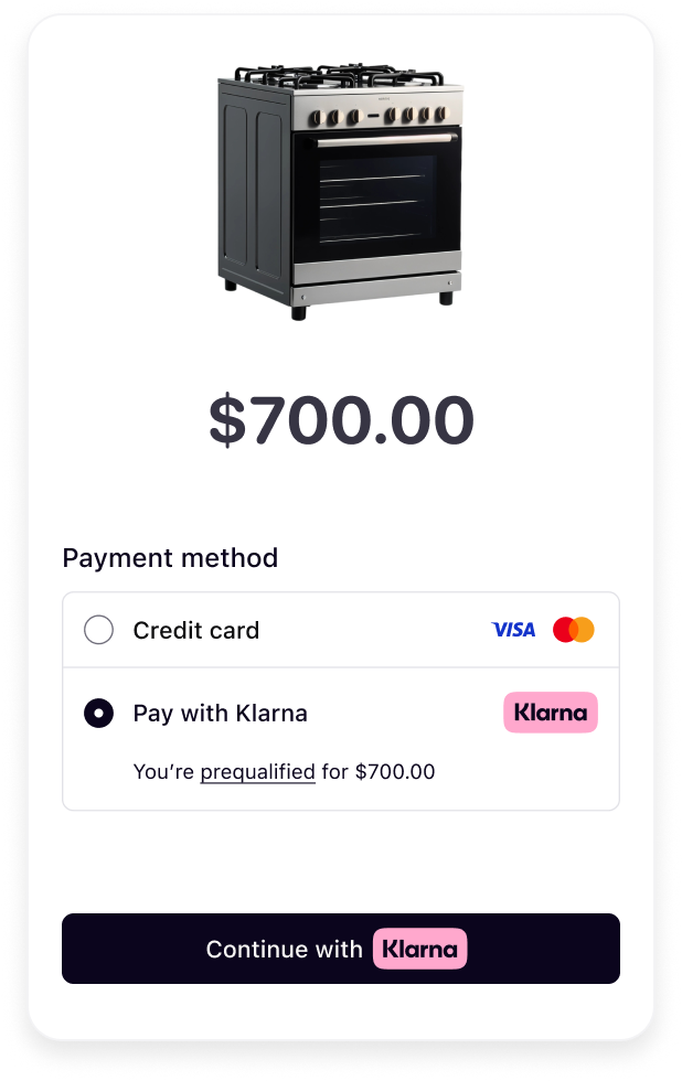
Customers should see a clear and accurate descriptor that dynamically adjusts based on their location, transaction details, and available Klarna payment options. The message presents Klarna’s customer value proposition in a structured way that allows customers to quickly compare their payment choices and make informed decisions. Where available the dynamic descriptor will prioritize messaging around pre-qualification, deals or 0% financing campaigns.
By using this element on your checkout, you enable Klarna to turbocharge your conversion rate.
Here are some examples of how the dynamic message adapts to different scenarios:
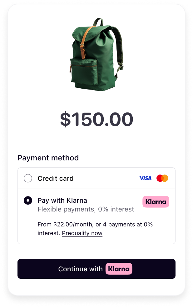 |  |  |
| Payment options | Deals | Pre-qualification |
Once Klarna is selected by the customer, the Payment button should be visually distinct and dynamically retrieved. A well-integrated, recognizable button ensures customers understand what happens next, making them feel confident in proceeding with their purchase.
For higher conversion, Acquiring Partners are encouraged to use Klarna’s branding with the Klarna Payment Button, which reinforces trust and clarity.
As Acquiring Partners can have different layouts and content in the Payment form of their checkout, Klarna provides different options that can cater to different layout needs.
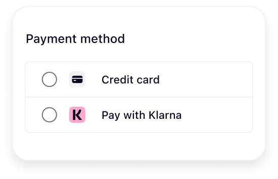
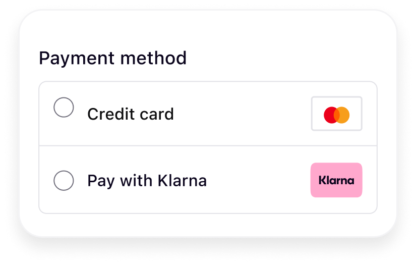
Klarna offers in alternative to its recommended badge logo, a rectangular and a square logo to suit different payment form layouts:
- Badge: Recommended option that is ideal for displaying the full Klarna logo. Is best used when there are no width restrictions.
- Square: Designed for limited space layouts with a 1:1 aspect ratio.
- Rectangle: Designed for layouts with a 2:3 aspect ratio.
For optimal clarity and brand recognition, Klarna recommends using the badge, as it more effectively communicates the option to pay with Klarna.
 |  |  |
| Badge logo | Square logo | Rectangle logo |
Refer to this page for complete styling guidelines for the logo.
Klarna supports two layout variants for presenting the checkout through the Web SDK. The appropriate layout depends on how your checkout flow is structured, specifically whether it uses a radio button to confirm payment selection or automatically advances without a dedicated CTA button.
Regardless of the layout, Klarna is shown as a single payment method with a dynamically generated subheader. This subheader provides a transparent, concise message tailored to the customer and the specific purchase.
Selector with Call to action (CTA)
Use this layout when customers select their payment method using a radio button in your checkout and confirm their choice with a CTA button. There are 3 variants of presentations which Acquiring Partners can choose from so it aligns with their checkout.
Klarna also provides additional text with a link for customers to pre-qualify or learn more about Klarna’s payment offering. The CTA button must be updated to meet Klarna’s payment presentation requirements.
If a sub header is present it is seen before selection, whereas the message is exposed after selection.
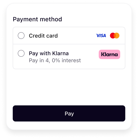 | 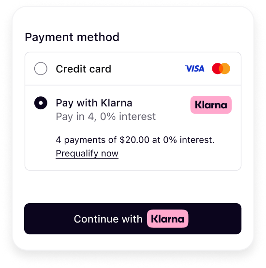 |
| Before selection | After selection |
Selector without CTA (Call to action)
Use this layout when the checkout flow navigates directly to the next step after the customer selects a payment method—without a CTA button.
A short description of Klarna is recommended before selection. The sub header is dynamically generated to reflect purchase details and promote transparency, helping customers make informed decisions with minimal interaction.
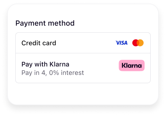
Refer to this page for complete styling guidelines for the headers and message.
Once Klarna is selected the main call-to-action (CTA) button is updated with dynamic copy, "Continue with Klarna”. The Klarna payment button includes dynamic copy and the Klarna badge. It also includes customizations to support dark and light mode and rounded or square button types to best align with the checkouts style.

Refer to this page for complete styling guidelines for the payment button.
When customers use Klarna’s boost features, such as On-Site Messaging, Klarna Express Checkout, or Sign in with Klarna, a session is created to maintain checkout continuity. This session connects all interactions with Klarna, retaining payment preferences and reducing friction at the checkout.
For Acquiring Partners, supporting this session-based logic is essential. When a Partner shares an Interoperability Token, it indicates a preference to optimize the Klarna experience.
Respecting these instructions helps ensure that Klarna’s optimizations are fully reflected in the checkout flow. This not only improves performance for shared merchants but also reinforces the value Acquiring Partners provide by enabling a more seamless and effective integration.
By providing an Interoperability token at checkout Klarna can reference previous interactions and provide presentation instructions. Klarna will respond with one of the below, indicating what action should be taken by the Partner responsible for rendering the checkout:
Klarna should be available in the payment form, respecting the ordering of the Partner and the Klarna guidelines.

The customer has already approved the purchase or shown clear intent for paying with Klarna. The payment form must show only Klarna and collapse all other options with a UX pattern implying that no choice needs to be made as it was done previously.
Other options can be uncollapsed if the purchase with Klarna fails.
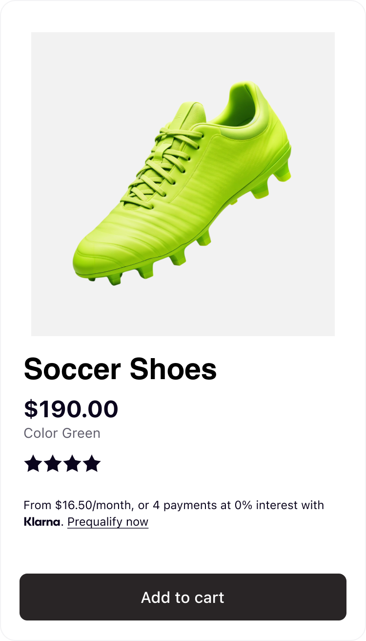 | 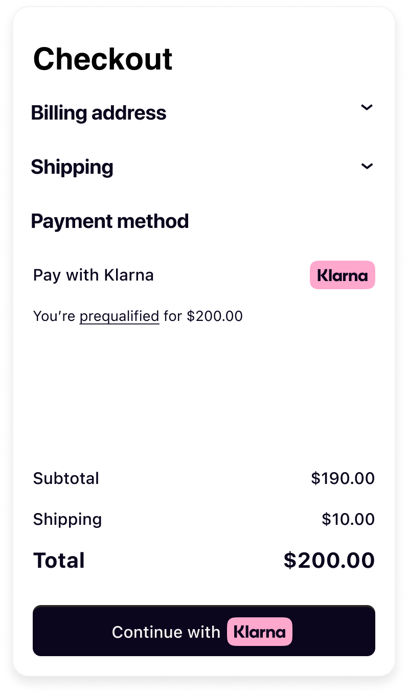 |
| Customer prequalifies from the On-site messaging on the product page. | Based on Interoperability Token, customer is recognized in the checkout and Klarna is preselected and pre-qualification messaging is exposed. |
The customer is recognized by Klarna and likely to pay with Klarna. The payment form must pre-select Klarna and be listed as the first option to optimize conversion rates.
Klarna suggests collapsing all other payment methods.
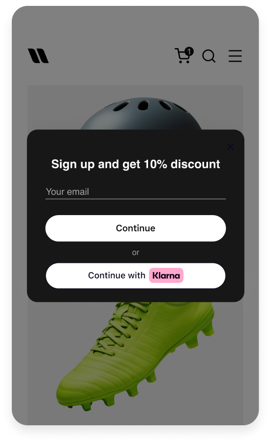 | 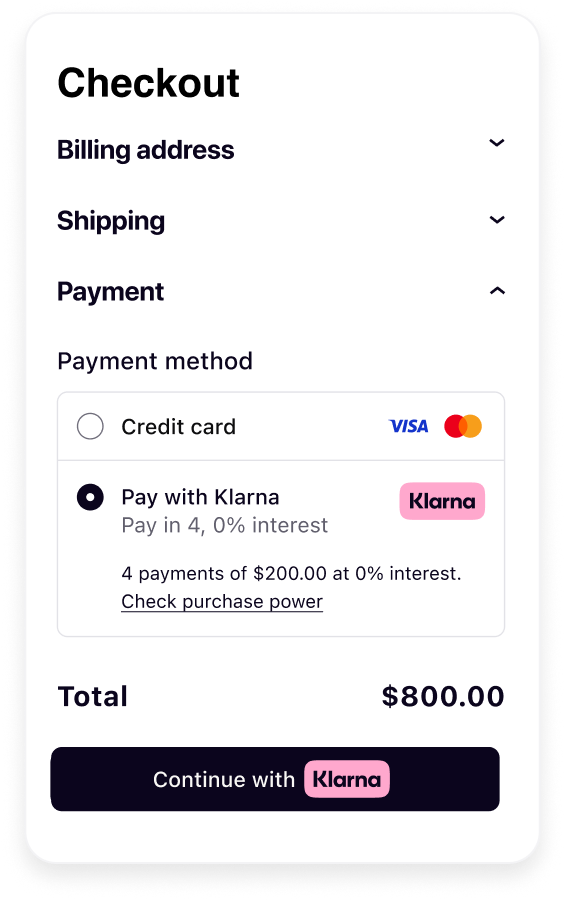 |
| Customer signs in with Klarna | Based on the Interoperability Token customer is recognized in the checkout and Klarna is preselected. |
When integrating Klarna into your checkout that groups payment methods into categories, it’s important to reflect Klarna’s full capabilities. Klarna is not just a Buy Now, Pay Later (BNPL) provider—it offers a comprehensive suite of payment solutions, including pay now, pay later, and financing options, all designed to provide a seamless and flexible shopping experience for customers.
Therefore, Klarna should be grouped under “wallet” or “mobile payment” methods and not be limited or labeled under “installment payments”. This better reflect its multifunctional customer offering and ensures accurate representation by avoiding reducing Klarna to a single payment option.
Acquiring Partners need to ensure that Partners integrated through them also follow these same guidelines.